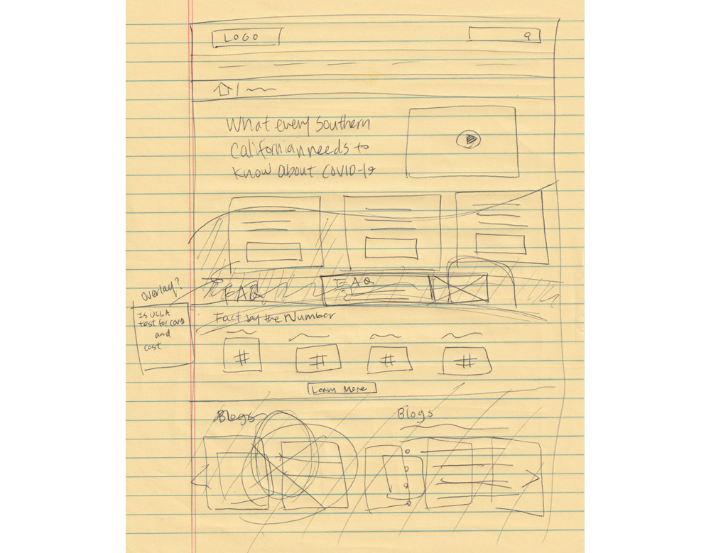
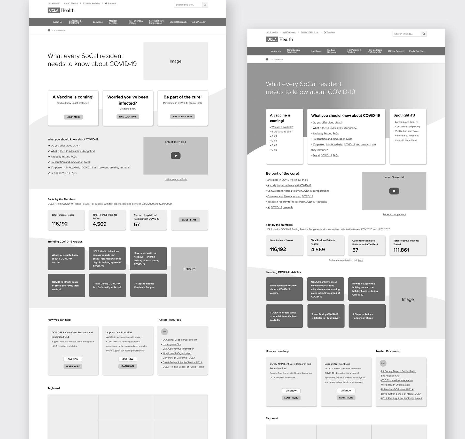
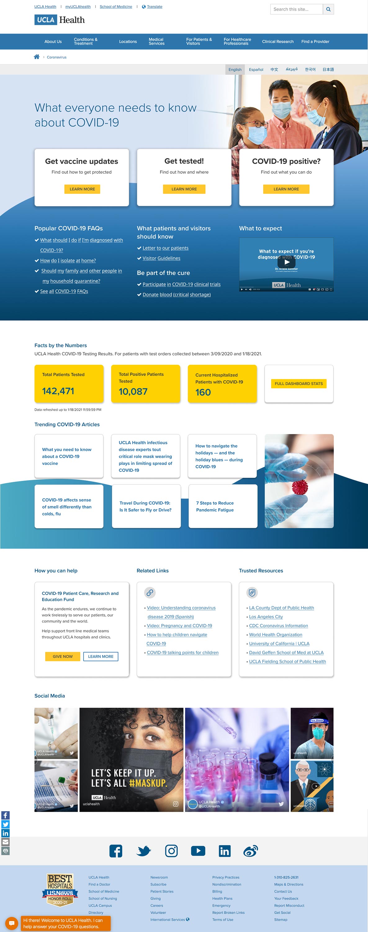
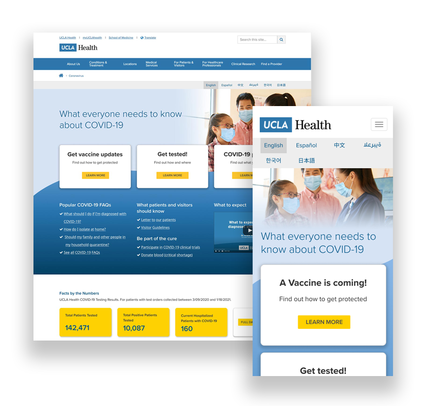
CORONAVIRUS LANDING PAGE

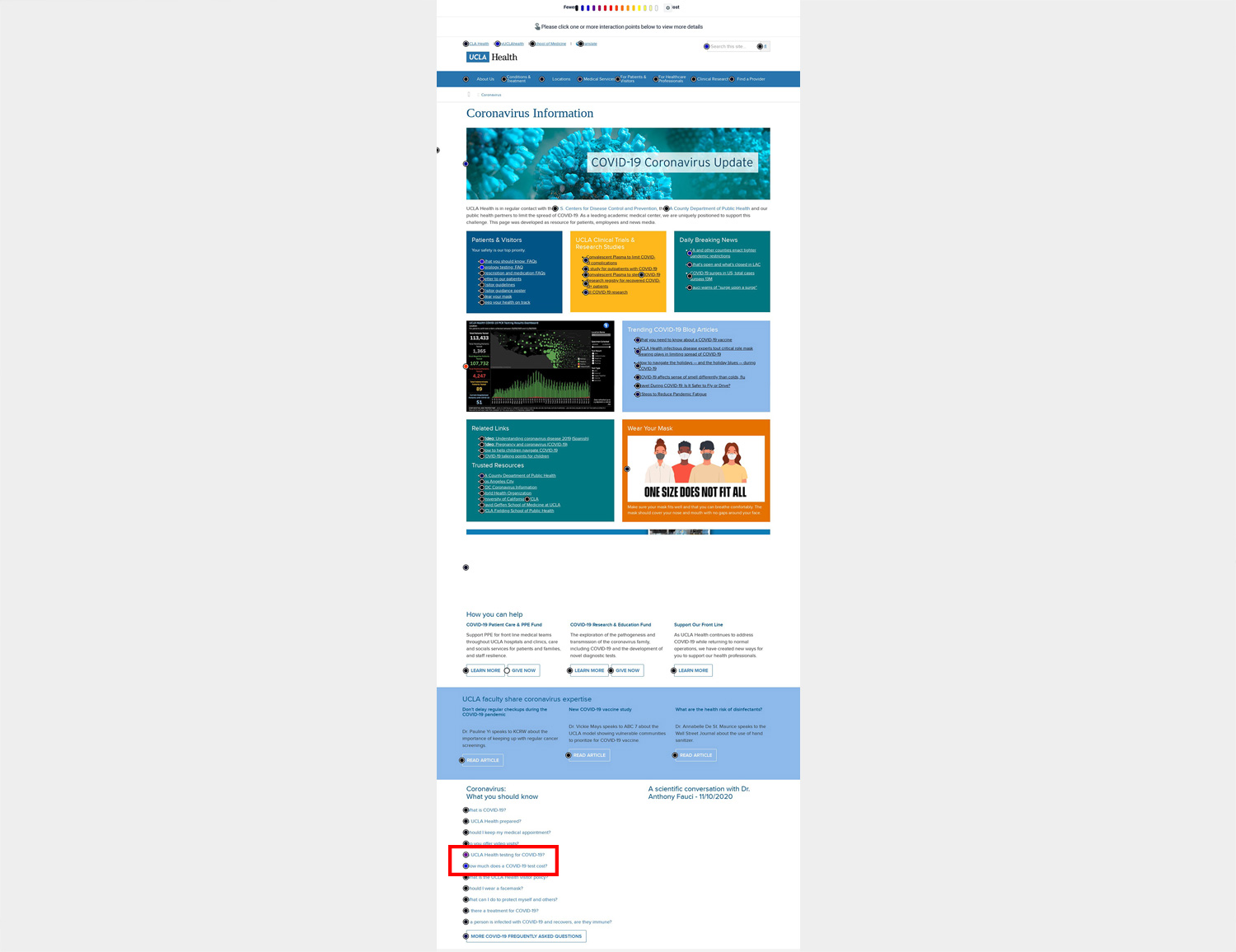
The original coronavirus landing page was convoluted with vast amount of information and links packed on the page. It was difficult to scan through and use. With the second surge of coronavirus cases on the rise, the page needed to revamp to better serve the users.

How I solved the problems:
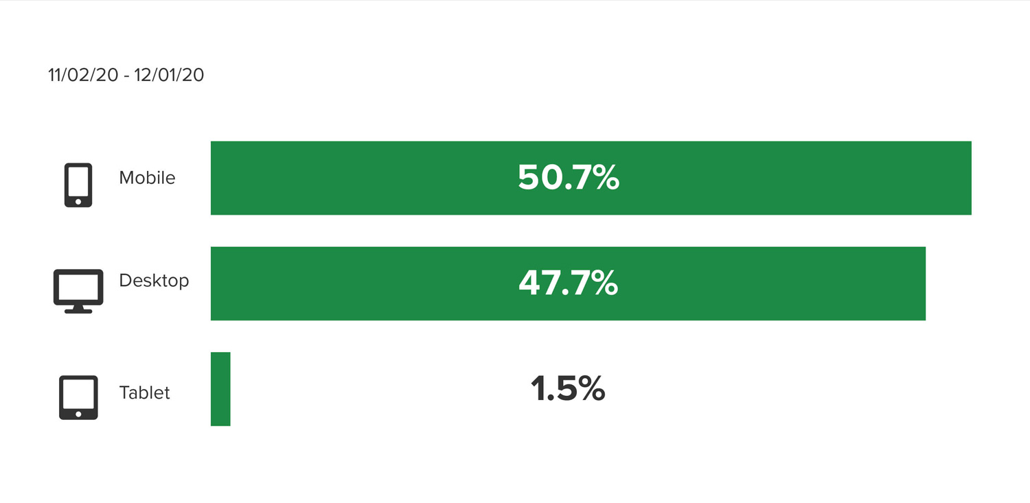
  • Looked at analytics
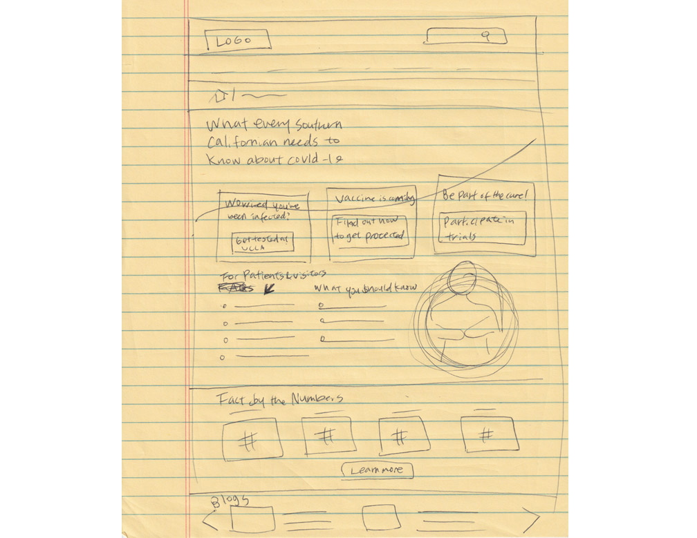
  • Placed the most viewed info. above the fold
  • Removed old content, consolidated redundant info., and added new items
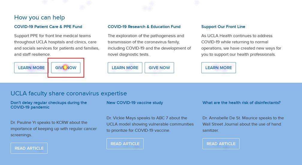
  • Gave hierarchy and clear CTAs
  • Provided consistent UI that provided clear directions and cues
  • Made it mobile friendly

OVERVIEW

The project shows my critical thinking skills to identify problems to solve, problem-solving skills to remove the problems, and analytical skills to evaluate the design solutions.

PROBLEM

The original landing page wasn’t performing its duty which was to help patients and journalists of UCLA Health quickly get the latest info. and resources related coronavirus. The page suffered from high bounce rate and cognitive overload due to cramming the page with a lot of info. and not aligning the design with user needs. As the second wave of coronavirus infection hit, the page required redesign to introduce new content such as vaccine info. and make the page useful.

COMPANY GOALS

  • Provide latest coronavirus info. and resources for patients and journalists
  • Provide vaccine info. and answer any questions users might have about vaccines
  • Assure people with safety at the doctor visits
  • Acquire participants for the clinical trials

USER GOALS

  • Find out if UCLA Health test for COVID-19
  • Find out the cost for the test
  • Look at COVID-19 FAQ
  • Want to know about antibody test
  • Look at visitor guideline
  • Want to find out about COVID-19 clinical trails
  • Want to donate to help with COVID-19

ACTION

To get insights into user behavior and expectations, I reviewed click maps, heat maps, behavior tracking (user paths), and device usage.

Click Maps & Heat Maps

A Click map revealed that some users scrolled all the way down the page to get to the info. they needed – two FAQs.

"Is UCLA Health testing for COVID-19?" and "How much does a COVID-19 test costs?" were the two questions frequently clicked. As seen in the image, the links are all the way at the bottom.

From a heat map, I discovered that the Give Now button was also a popular link placed at the lowever half of the page.

A Heat map showing the Give Now button being used frequently.

Behavior Tracking

Behavior tracking shows user activities – how users have traveled from page to page. By looking at paths users took from the coronavirus page, I got insights into what info. users were seeking on our site.

  • Roughly 60% users ended the visits after visiting the landing page.
  • 8.1% clicked on the Give Now button to donate for patient care & PPE fund.
  • 7.2% clicked on a dashboard image to access the testing results dashboard.
  • 3.8% went to the "Is UCLA Health testing for COVID-19" module and then went on to visit the "Where can I get tested for COVID-19?" page.
  • Slightly more than 3% went to the COVID-19 FAQ page and then ended up on the "Where can I get tested for COVID-19?" page.

Device Usage

From device usage analytics, approximately half of users used mobile devices to visit the landing page. Therefore, the new design needed to support mobile users and assist in accomplishing tasks users set out to do on mobile devices.

  • 50.7% of users used mobile devices. It’s critical to make the page mobile friendly.
  • 47.7% used desktop. Desktop users should be able to discover and get to content they need with ease.
  • 1.5% used tablet.

Analysis

Here are analyses after reviewing the analytics.

Wireframes and mockups

In consideration of the analyses, wireframes and mockups were made.

Wireframe sketches
Wireframe Sketch 1
Wireframe Sketch 2
Wireframes in black and white
Mockups in color

RESULTS

Desktop UI
Final coronavirus desktop UI.
Mobile UI
Final coronavirus mobile UI.

How I solved the problems

  • Placed “Get tested” front and center in a CTA card to answer popular FAQs (“Is UCLA Health testing for COVID-19?” and “Where can I get tested for COVID-19?”)
  • Gave “Get vaccine updates” a prime spot (top left corner) in a CTA card to so that users can get to the latest vaccine info.
  • Gave hierarchy – main content was divided into three sections. The most important info. was placed at the top, moderate importance in the middle, and least importance in the last section.
  • Removed old content, consolidated redundant info., and added new items
  • Provided consistent UI that provided clear directions and cues
  • Made it mobile friendly

Analytic Results

  • Bouce Rate decreased from 68.71% to 30.04%
  • Visits went up from 35,548 to 51,207
  • Page views increased from 41,412 to 63,971
  • Returning visitor boosted from 4,396 to 8,139
SEE THE LIVE PAGE

ITERATE

Monitoring analytics

After publishing the page live, I have been monitoring the page analytics and finding out that bounce rate is creeping up. This may be because user goals are shifting as news about the vaccine changes rapidly. The coronavirus page needs to reflect its changes and keep up with the content so that it won’t get stale. So, I took a look at the vaccine hub page analytic and came to the conclusions below:

Proposed design updates
Organizing content

RETROSPECTIVE

Though we are successful in decreasing the bounce rate significantly and increasing visits, we’re not certain if users have found what they are looking for. Reading the analytics alone can’t tell the whole story. Therefore in the future, it’s best to conduct usability studies to test our design and iterate the design to keep improving the page.