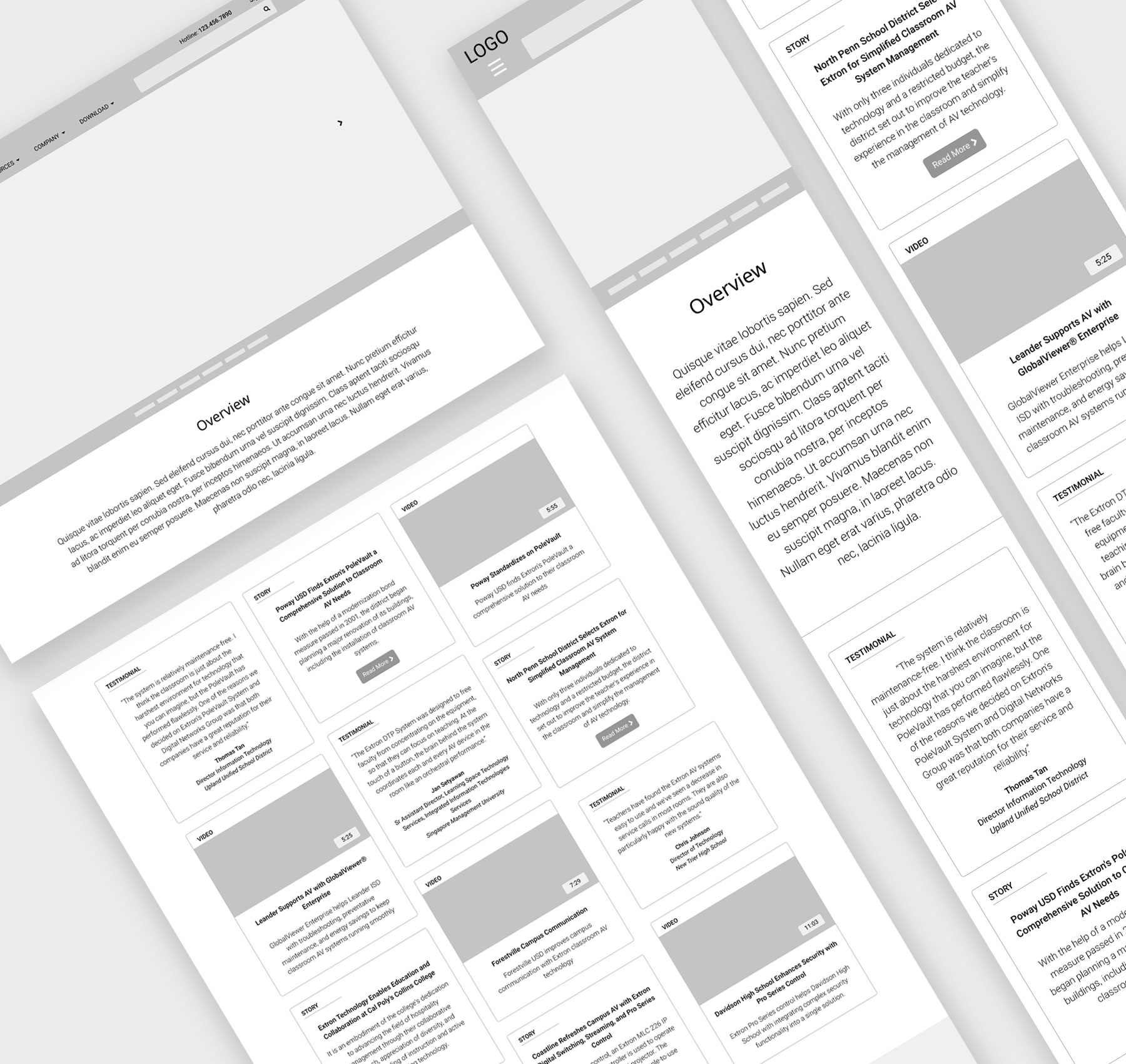
RESULTS
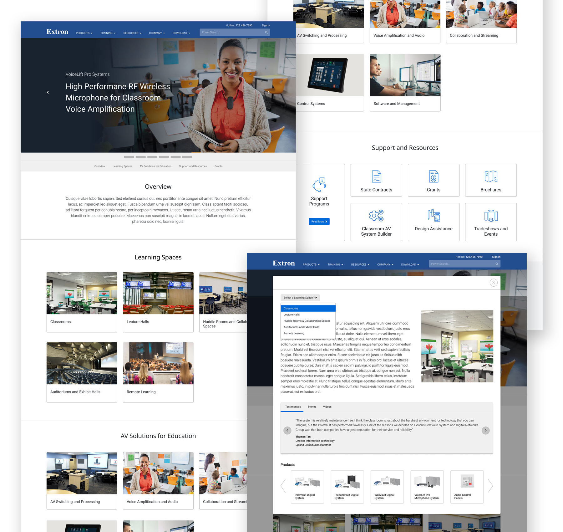
After exploring several ideas, the Spaces and Solutions idea with the little twist became the final design solution. Organizing content by learning spaces and solutions remained intact. All of the content from the Spaces and Solutions idea also moved forward to the final design. The difference we made was that the content was placed in a overlay window instead of the card section below, shortening the page length and eliminating the page scroll. When the sub navigation links were clicked, overlay window appeared and revealed the corresponding content instead of auto-scrolling.
SEE THE LIVE SITE
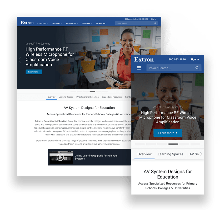
Desktop
Key features:
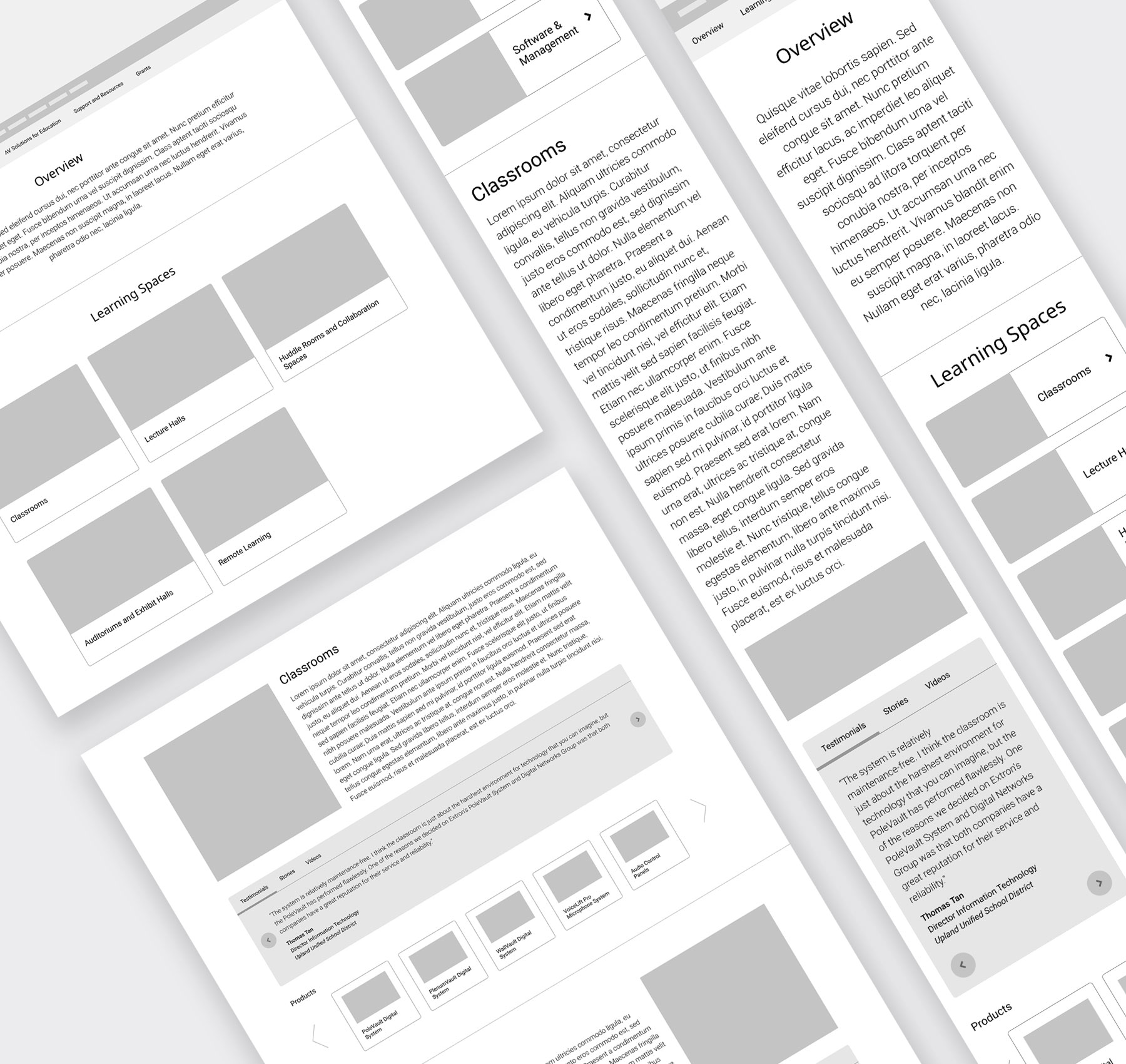
- Cards were provided to display various learning spaces and AV solutions.
- Corresponding content for leaning spaces and AV solutions were eliminated from the main landing page and placed in a overlay window.
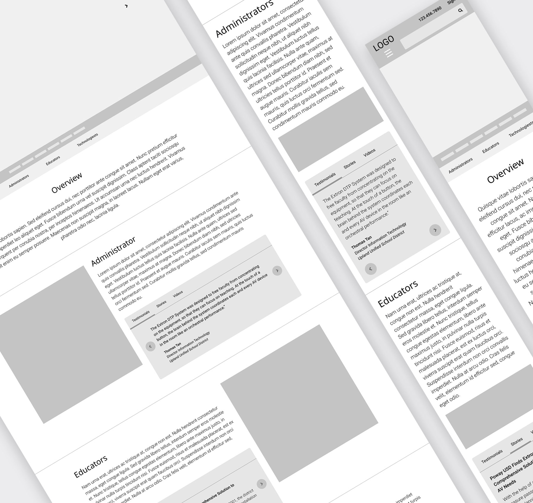
- A sub navigation revealed content in a overlay window.
- A dropdown menu on a overlay window provided direct access to other content under the same section–Learning Spaces, AV Solutions.
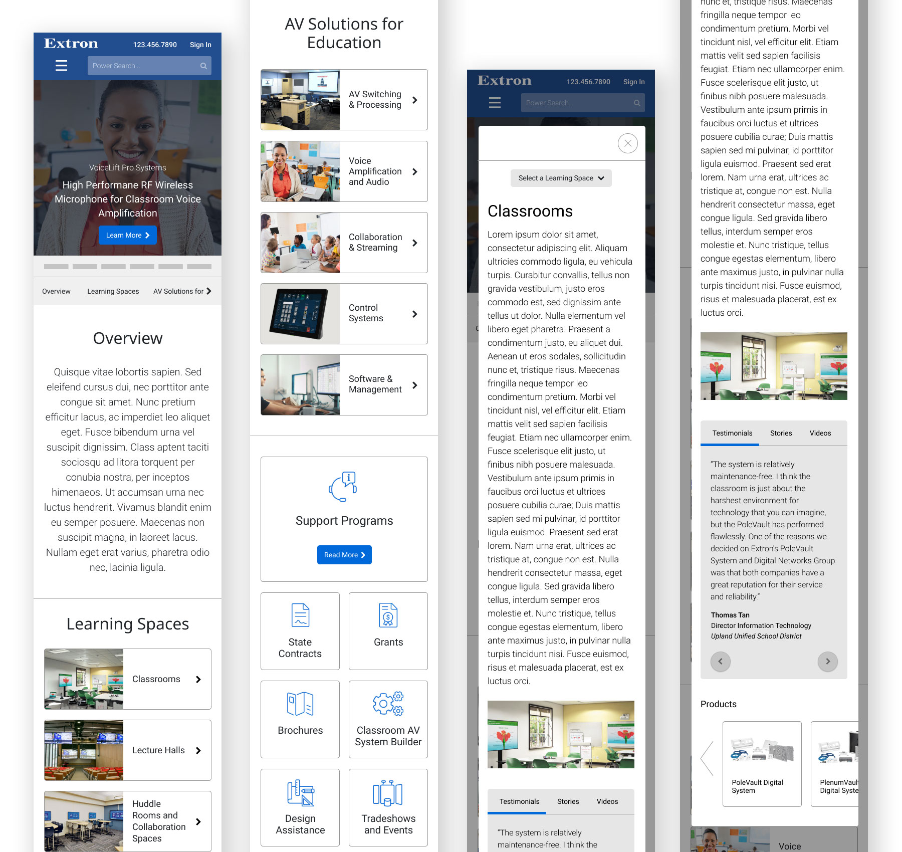
Mobile
Key features:
- The cards became a horizontal view, providing adequate space for both an environmental shot and the corresponding title.
- The left and right buttons to scroll through content on the Testimonials, Stories, and Videos panels were placed under the content instead of left and right side of the content.
- Associated products can be scrolled through by swiping left and right.