Usability Test Results
Usability testing was conducted by user researchers. Two designers including myself and a researcher watched usability testing live. Here are a summary of usability test findings.
The proposed design was presented to four users, design engineers, for feedback. Overall, they found our proposed design efficient, saving the number of clicks to get to the desired trainings. However, they found some areas confusing and suggested improvements.
KEY FINDINGS:
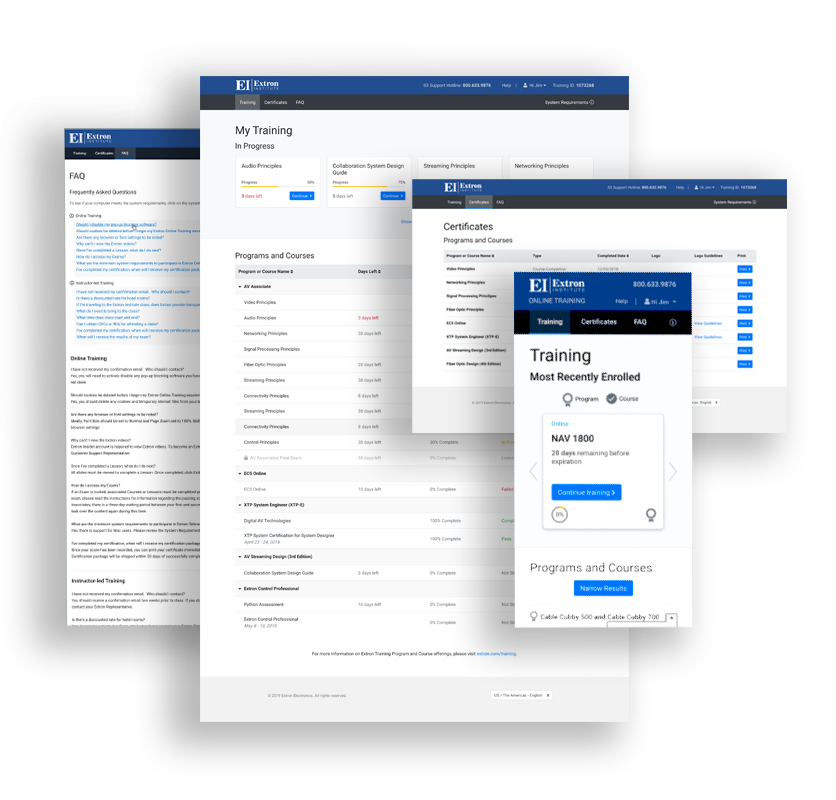
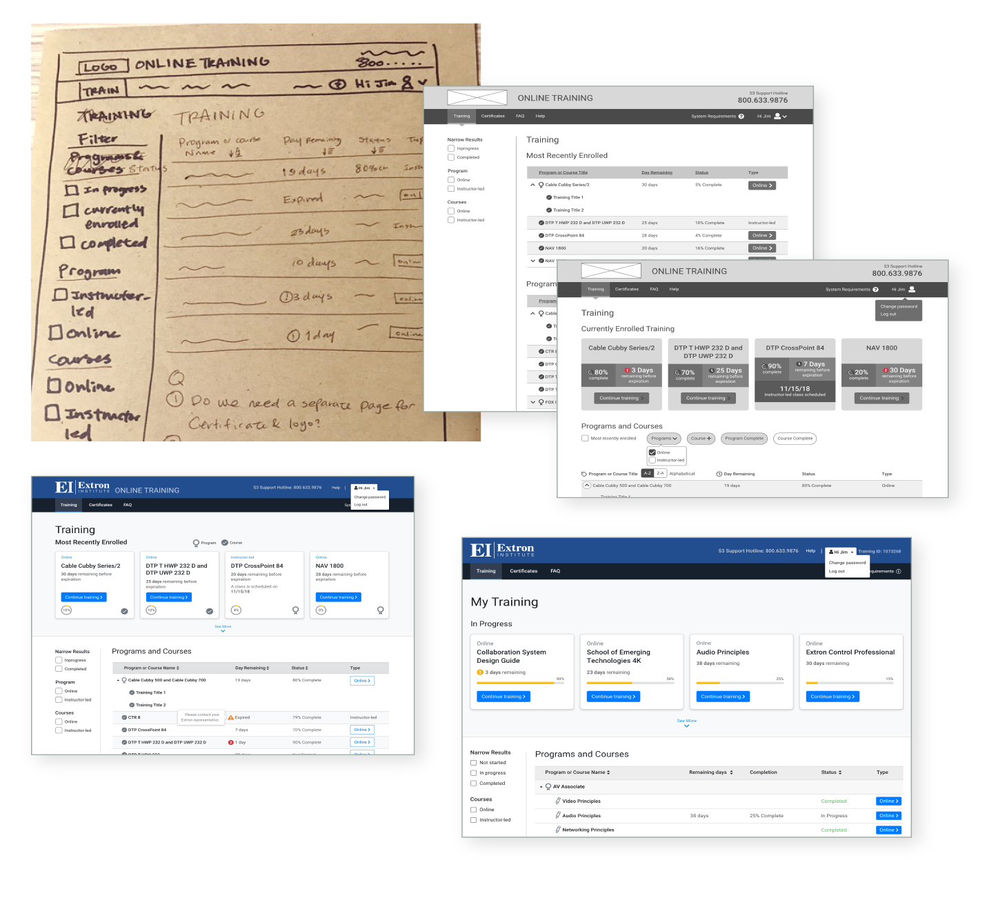
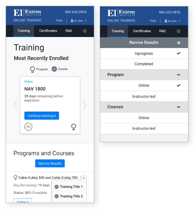
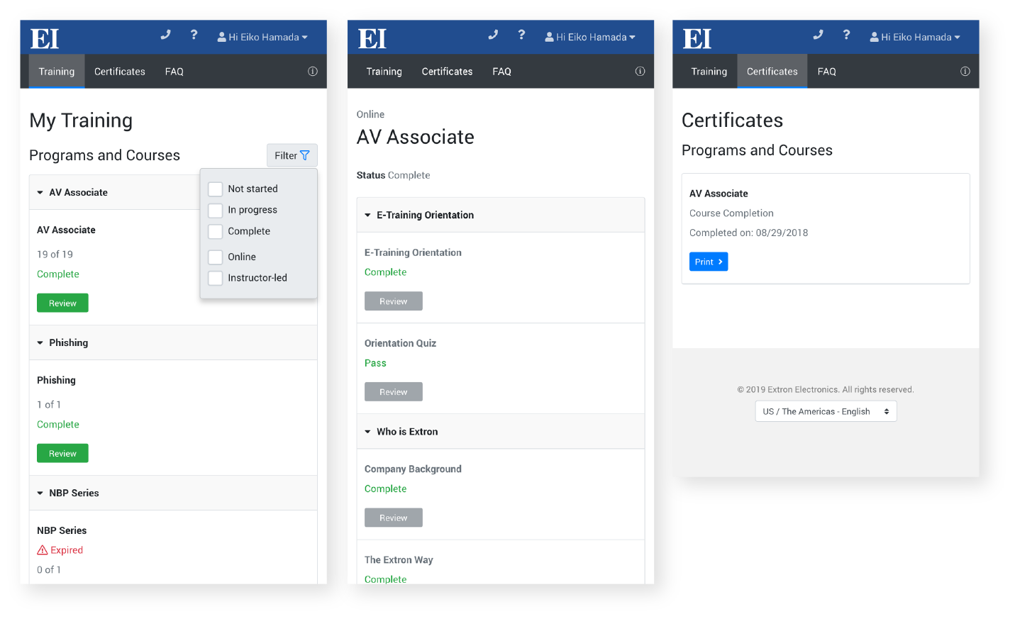
Training Page
Dashboard (page top with cards)
- Didn’t understand the difference between dashboard items and list items.
- Confused about what was in the dashboard (What is Most Recently Enrolled?).
Course Page
- Didn’t understand what remaining days mean.
- Didn’t like the Launch Course buttons being placed far from the rest of items in the list.
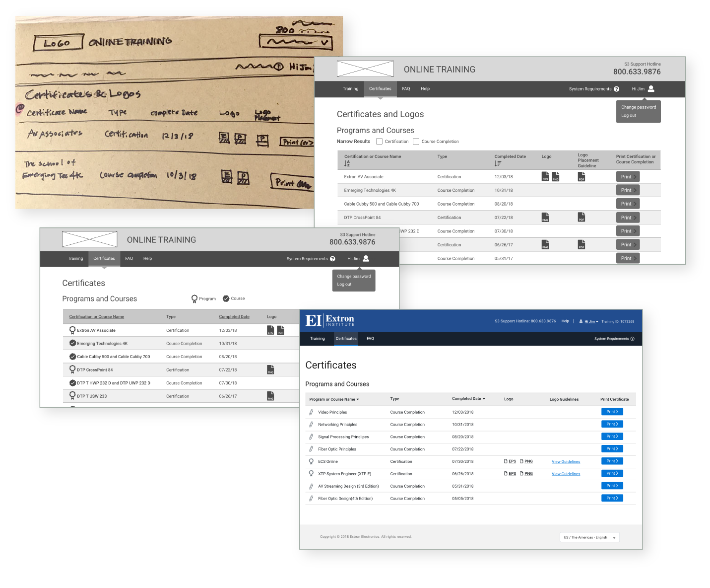
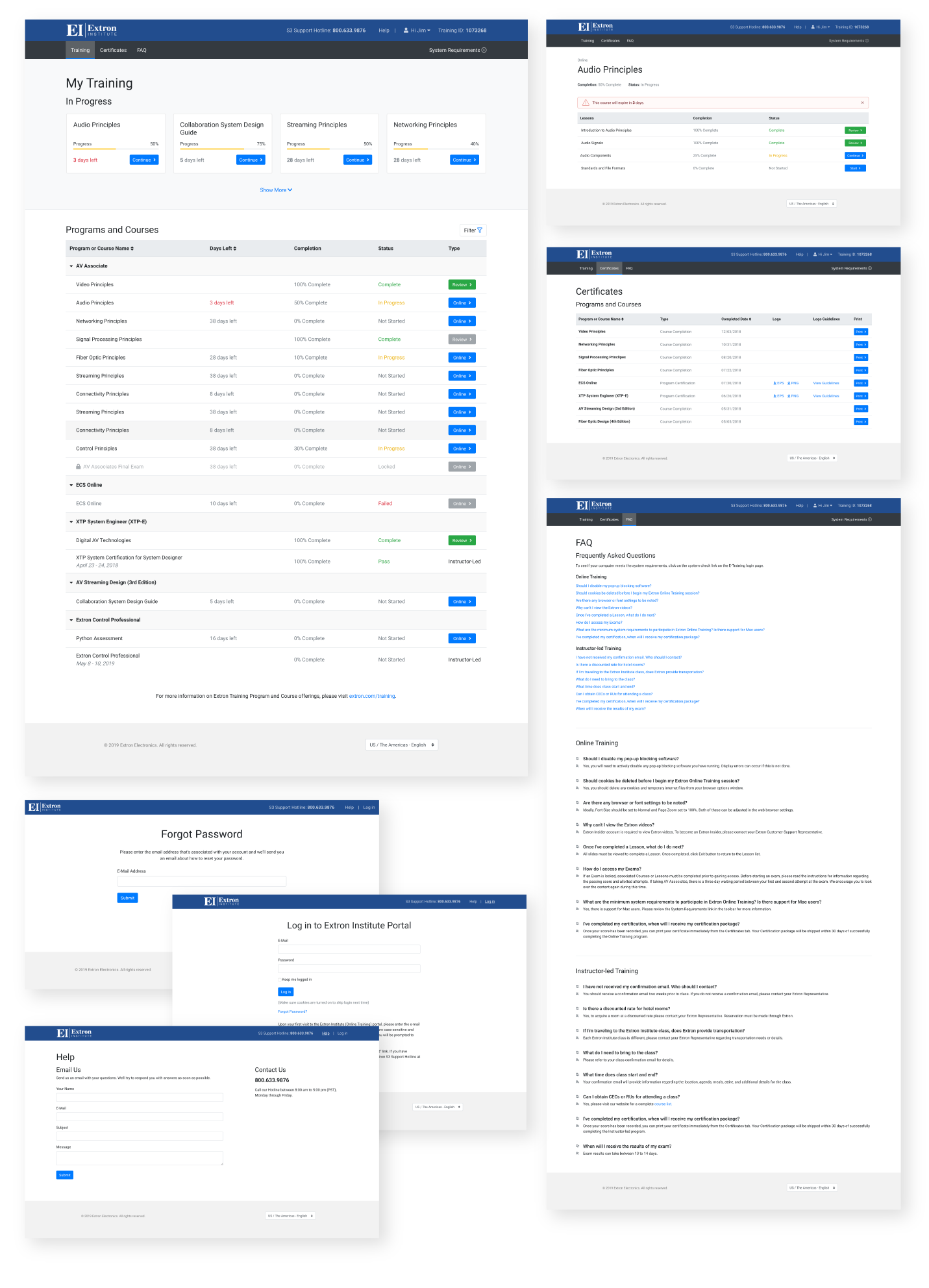
Certificate Page
- Didn’t understand what Logos and View Guidelines were.
- Would like to see expiration dates for certifications if they expire.
- Wanted a filter to sort certifications and course completions.