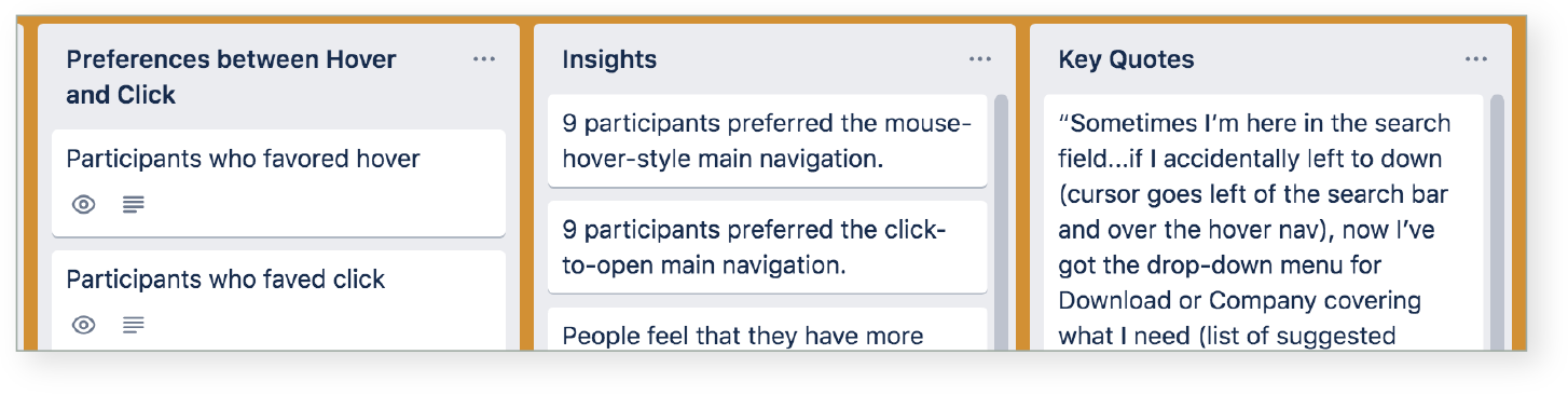
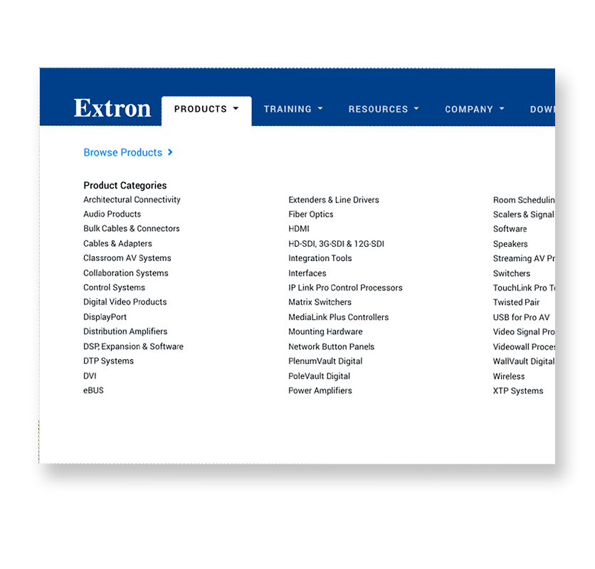
EXTRON MEGA MENU HOVER VS CLICK

A main navigation on an Extron website was provided as a Mega Menu that opened on hover. However, there were some growing complaints about the clunkiness of the feature. I was asked to investigate whether or not click worked better than hover for users.


OVERVIEW

This project shows my ability to plan a user research, write interview questions and scenario tasks, conduct a usability testing, and drive conclusions from research findings.

PROBLEM

There have been raising complaints from users and internal staff about the clunkiness of Mega Menu hover feature that occasionally causes menu to get stuck and interferes with users activities on the website. A user research is needed to find out whether or not click works better than hover for users. Is there a preference among users?

ACTION

Write a user research proposal

To gain buy in on a usability testing, I wrote a research proposal and included the following topics:

  • Overview
  • Problems
  • Assumption
  • The purpose of user research
  • Research questions
  • Method
  • Tentative schedule for the usability testing
READ PROPOSAL

Create an interview guide

An interview guide was carefully crafted to gain insights into users behavior, expectations, and preferences on two versions of Mega Menu, mouse-hover-style and click-to-open. Shown below is an overview of the interview guide.

Background and Warmup

  • For what purposes do you most commonly use Extron’s website?
  • Have you used the main navigation on Extron’s website before? When you used it, did the main navigation open and close as you expected or not? Was there anything that frustrated you?
  • If you were to browse Extron’s website using the main navigation, how would you do that? Will you describe what you will do and what happens to the navigation?

The question is to investigate user expectations on Mega Menu. Will users expect to see menu opens up on hover or click?

Test Tasks

TASK 1
  • Do you remember the most recent time you used the main navigation? Can you show me how you used it? Was there anything that frustrated you? If so, what was it?
TASK 2

HOVER

  • Using the main navigation at the top of the website, can you show me how you would access Speakers?

CLICK

  • Using the main navigation at the top of the website, can you show me how you would access Fiber Optics?
  • Will you describe what you did and what happened?
TASK 5

BOTH HOVER AND CLICK

  • Using the main navigation, can you show me how you would access the Products home page?

Interview Questions

All participants:

Tell me about the overall experience of how the navigation behaved.

  • Did you like how it opened and closed? Can you tell me your thoughts?
  • On a scale of 1 to 10 with 10 being the highest, how would you rate the main navigation behavior and why?
  • Would you change how it behaves or not?

If the participant was tested on a hover main navigation:

  • You were tested on a mouse-hover-style main navigation but how do you think you’ll feel if you get a main navigation that opens up when it’s clicked instead of hovered over?
  • Say you’re going to use touch devices such as a tablet to browse Extron’s website. Since touch devices don’t support hover state, you would need to click the main navigation to open. How would you feel about that?
READ COMPLETE INTERVIEW GUIDE

Conduct Usability Sessions

For the study, we tested with a group of internal users. Eleven participants were from Marketing, four were from Product Development, and three were from Sales. We prepared two versions of Mega Menu that behaved differently. One version was a mouse-hover-style and the other was a click-to-open. Both versions were given to all participants without notifying them which versions they were tested on. The idea was to see whether or not one performed better than the other and if there were preferences among users.

Analyze the Data

After the tests, we identified commonly expressed opinions and frustrations and created cards with insights. We also collected corresponding quotes

Usaility Test Data

RESULTS

Executive Summary

The usability testing performed on a total of 18 participants revealed that there were benefits and disadvantages to both mouse-hover-style and click-to-open Mega Menus. The test findings also proved that both versions performed equally and equal number of people preferred hover and click features. The table below illustrates the task results. A total of eight tasks were given to participants. Four tasks were performed while using hover menu and the other four tasks were performed while using click menu.

PARTICIPANT HOVER CLICK
Participant 1 HOVER: 1 unsuccessful task CLICK: All successful
Participant 2 HOVER: 1 unsuccessful task CLICK: 1 unsuccessful task
Participant 3 HOVER: All successful CLICK: All successful
Participant 4 HOVER: All successful CLICK: All successful
Participant 5 HOVER: 1 unsuccessful task CLICK: All successful
Participant 6 HOVER: All successful CLICK: All successful
Participant 7 HOVER: All successful CLICK: All successful
Participant 8 HOVER: All successful CLICK: All successful
Participant 9 HOVER: All successful CLICK: All successful
Participant 10 HOVER: NA CLICK: All successful
Participant 11 HOVER: All successful CLICK: All successful
Participant 12 HOVER: All successful CLICK: NA

Key Findings:

  • A few people feel that they have more control over navigation and can prevent accidental popups of navigation when they have the click-to-open menu.
  • Most people are not bothered by hover or click features. Several people experienced issues with the hover menu being opened and closed inadvertently.
  • People don’t seem to experience any problem moving from a mouse-hover-style menu to click-to-open menu. Learning curve is fast.
  • The main reason why people favor the hover over click menu is that they can peak what’s under the Mega Menu panel without committing to the menu links. They feel that it’s faster to get out of a panel if they need to look under different a panel.
  • Few people who clicked on the mouse-hover-style menu lost the expanded Mega Menu panel and needed to hover over again to open it.
USERS’ VOICE

“Sometimes I’m here in the search field...if I accidentally left to down (cursor goes left of the search bar and over the hover nav), now I’ve got the drop-down menu for Download or Company covering what I need.”

USERS’ VOICE

“It (mouse-hover-style menu) easily let you know if you’re in the wrong place or not instead of having to go back.”

USERS’ VOICE

“It’s (click-to-open menu) a lot more tedious...you have to click to kind of preview anything.”

USERS’ VOICE

“It (click-to-open menu) wouldn’t bother me. It’s just an extra step.”

USERS’ VOICE

“It (mouse-hover-style menu) would close certain times when I didn’t want it to or it would open a menu when I didn’t want it to.”

USERS’ VOICE

“I would have mixed emotions because if my mouse moves somewhere in inadvertently or something just an accident, it’s (mouse-hover-style menu) kind of annoying.”

USERS’ VOICE

“Personally I’d probably like that better because it’s (click-to-open menu) responding to what I’m telling it to do, rather than doing something by itself.”

USERS’ VOICE

“I have had to go up to the power search area to make the menu (mouse-hover-style menu) close.”

USERS’ VOICE

“It (mouse-hover-style menu) doesn’t close when I think it should or would like it to.”

USERS’ VOICE

“Flow is little more comfortable...it’s (mouse-hover-style menu) just more polished somehow.”

USERS’ VOICE

“This one (click-to-open menu) will always do as I tell it to do. And there is not gonna be any mistakes...”

USERS’ VOICE

“To me, it’s (click-to-open menu) less intuitive and time consuming.”

Conclusions

With the test results showing the equal performance rate on both mouse-hover-style and click-to-open Mega Menu, the team decided to keep Mega Menu as mouse-hover-style and keep monitoring any issues regarding Mega Menu.