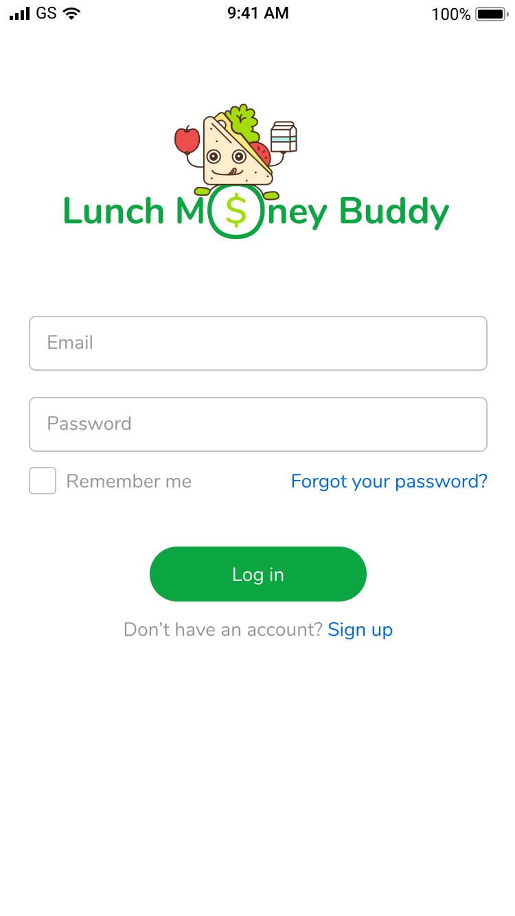
RESULTS
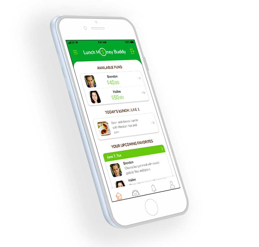
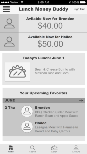
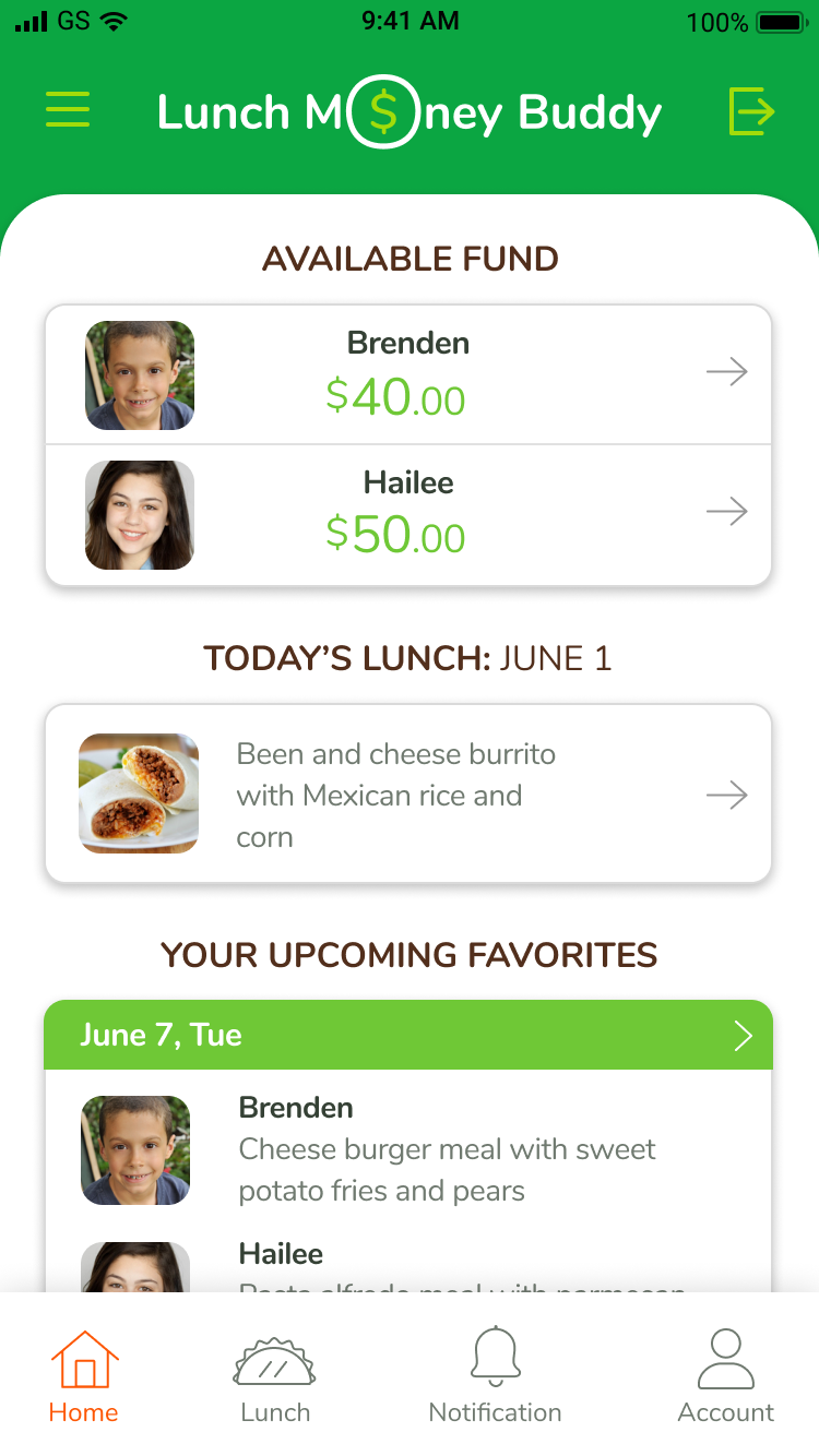
Home Screen
- The home screen provides an overview of the app, offering multiple access points for busy parents and guardian personas to perform tasks quickly.
- An available balance for each child is made accessible on the home screen. When the balance is low, users can simply click on each child’s balance to go to the add funds screen.
- A quick check on today’s lunch is made easy. A lunch menu is made accessible by one tap on the today’s lunch menu section.
- The next few days of a child’s upcoming favorites can be viewed by tapping the day or arrow.
- Categorical navigational structure is provided for the global navigation to compensate the guardian user model who is novice to using a smartphone. Everything on the app can be accessed through the global navigation withoutusing the hamburger menu.
SEE THE PROTOTYPE
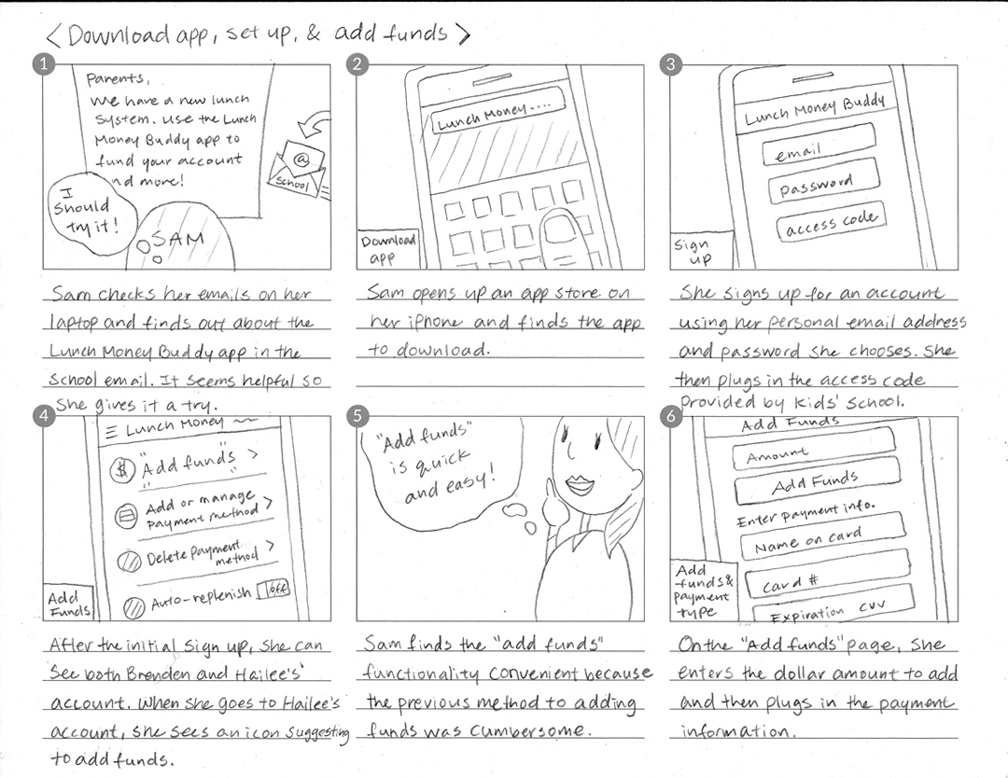
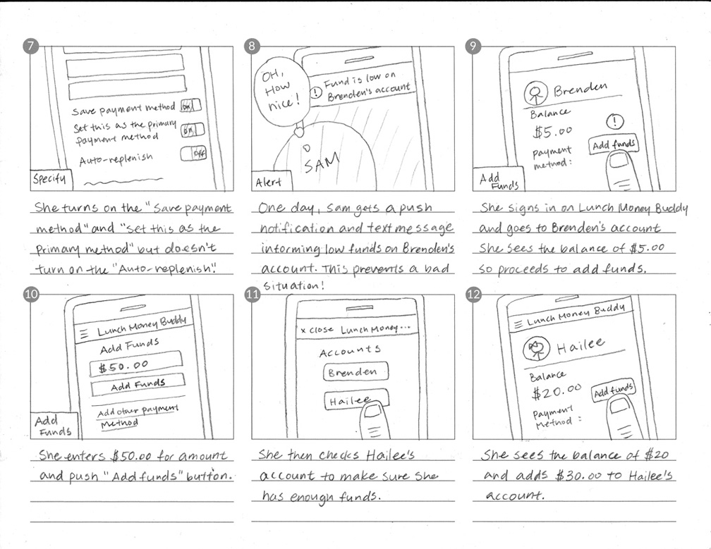
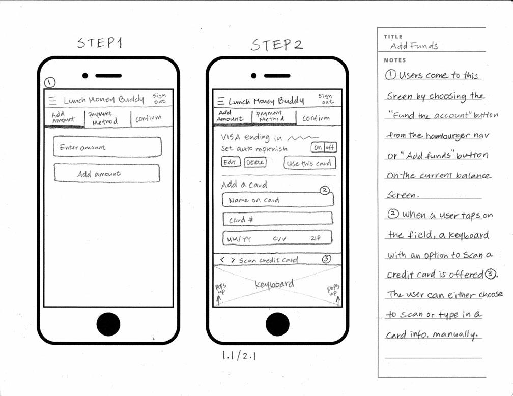
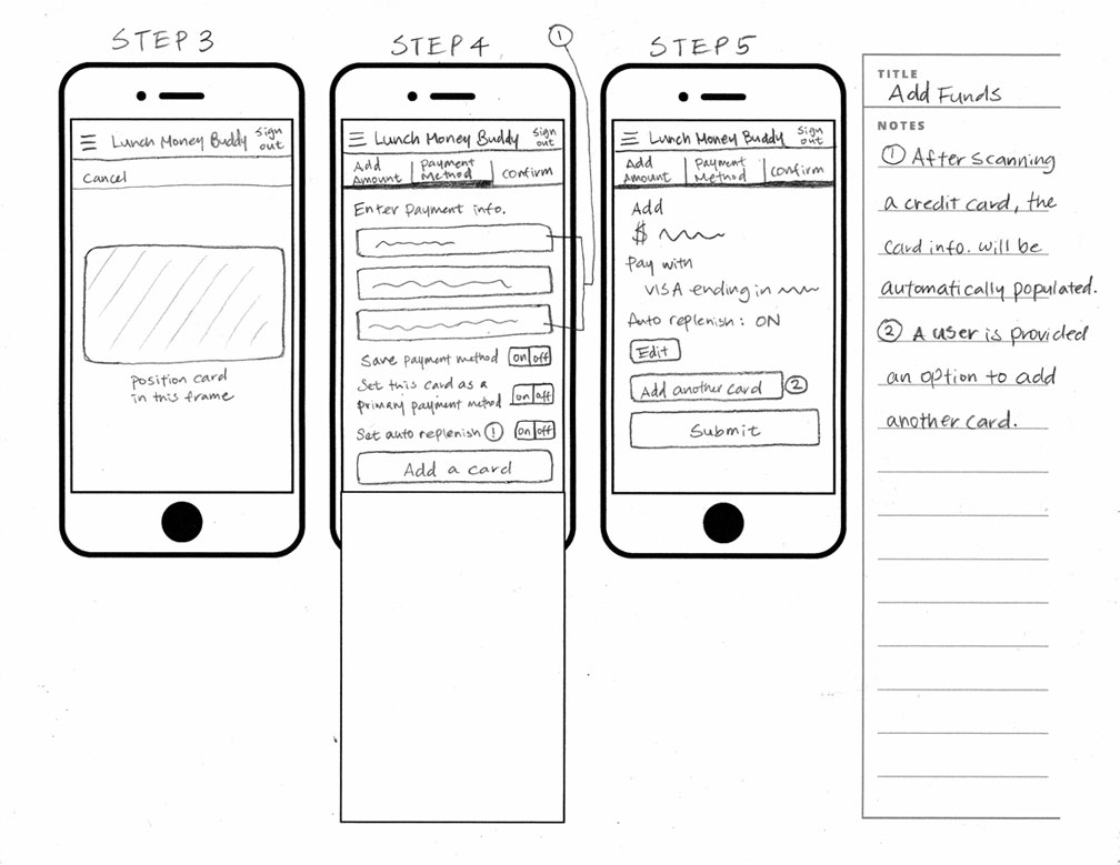
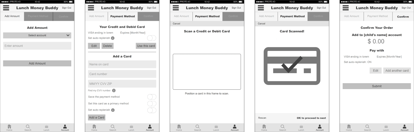
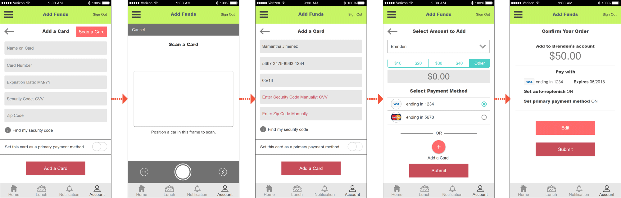
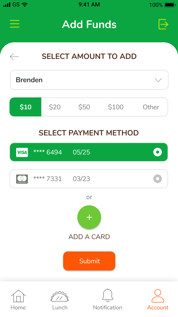
Add Funds User Journey
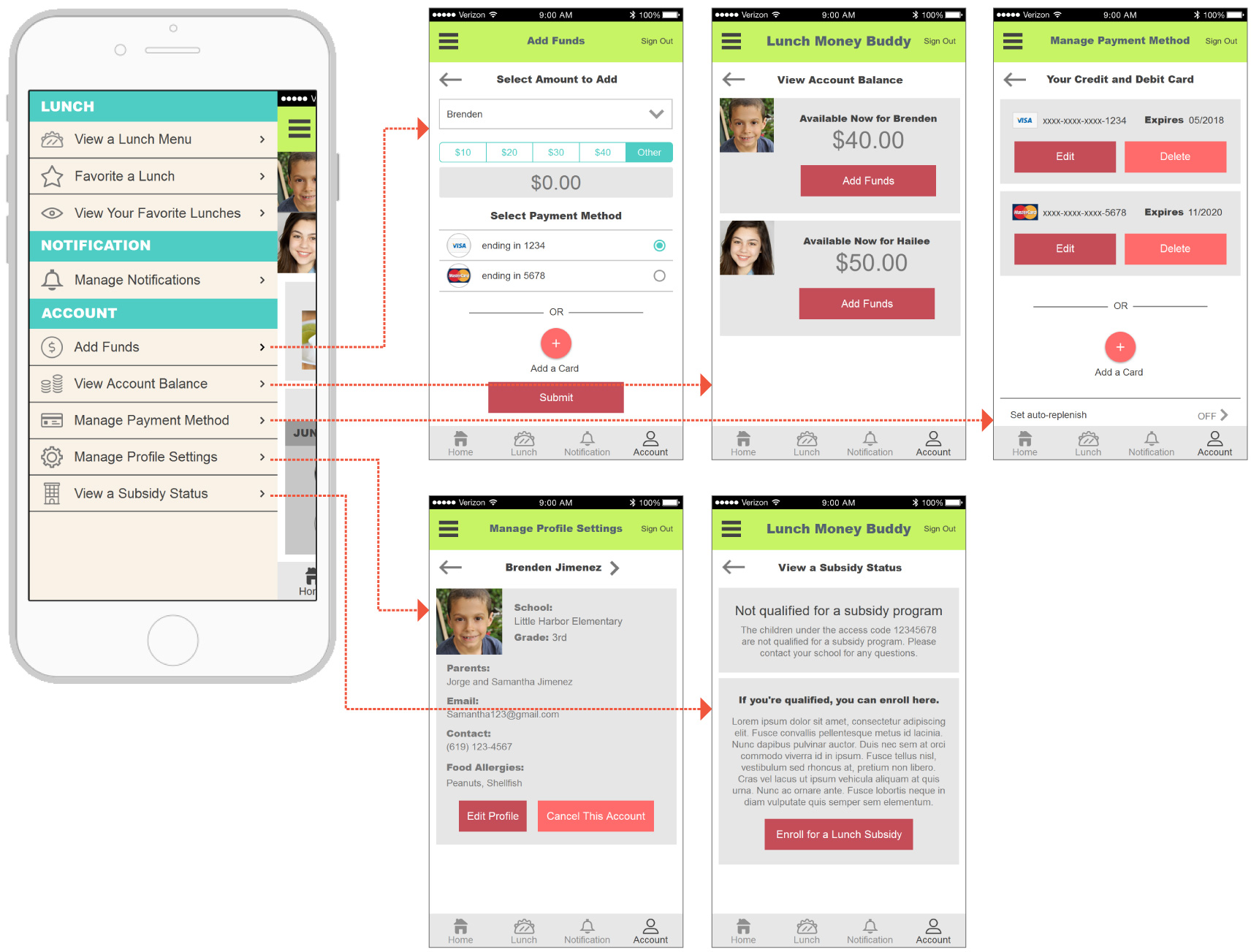
The first time adding funds is made quick and easy, especially for the parents user model who has advanced technology skills.
Adding funds for the first time means that a user needs to add a payment method. Entering card information can be cumbersome especially for busy users. This problem is solved by offering the card scanning technology that auto-populates the card information. The user just needs to enter the CVV and zip code manually. An account to add funds can be chosen from the drop-down menu, avoiding the user from going through multiple screens to get to the specific account. By offering the preset amount, the user won’t need to type in the amount to add unless they want to customize the amount.
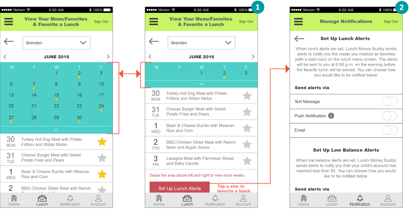
Favorite a Lunch User Journey
Checking out a lunch menu, viewing a child’s favorite lunches, and adding a lunch to favorites can all be done on one screen. The busy parents user model will appreciate this screen.
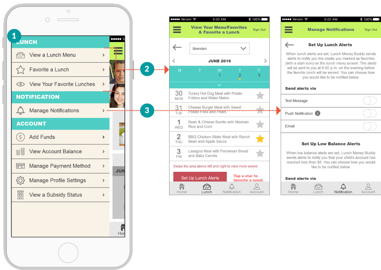
It seems like a lot of information to cram into one screen. The problem is solved by offering various pliancy and the right amount of microinteractions. The weekly calendar reveals the monthly calendar when the button below it is clicked. Tapping a star icon adds a lunch to favorites, which will be reflected on the monthly calendar. By swiping the lunch menu left and right, the user will be presented with the menu in different weeks. Selecting a child from the drop-down menu changes the calendar and lunch menu to correspond to the child. Setting up lunch alerts is made available through the contextual link.
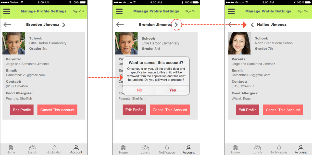
Close an Account User Journey
Closing an account feature is made available under the manage profile setting found from the global nav and hamburger menu. The user journey is designed specifically to accommodate the guardian user model; hence, the task was made extremely simple and easy to do without requiring to perform unique gesture control.
To close an account, a user simply needs to click the “Cancel This Account” button. To prevent a user from accidentally closing an account, the pop-up window with confirmation message is provided. To view and close another child’s account, either the arrow next to the child’s name can be clicked or the screen can be swiped left and right.
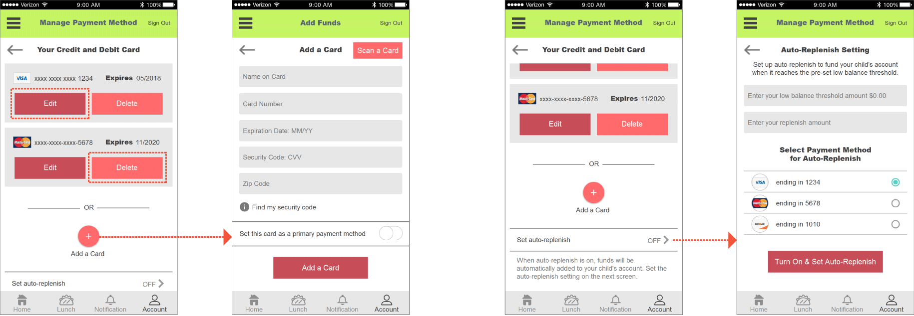
Manage Payment Method User Journey
The manage payment method is made available under the global nav and hamburger menu. For a user model such as the guardian persona, handling card information virtually can be an intimidating experience. To help the persona, one click edit and delete button are provided.
If a new payment method needs to be added, the guardian persona can perform the task by clicking the Add a Card button, which prompts the user to the Add a Card screen. Instead of scanning a card, which requires advanced technology skills, the guardian can manually enter the card information. When the new card is added, the auto-replenish setting can be set up so the user can forget about adding funds again.
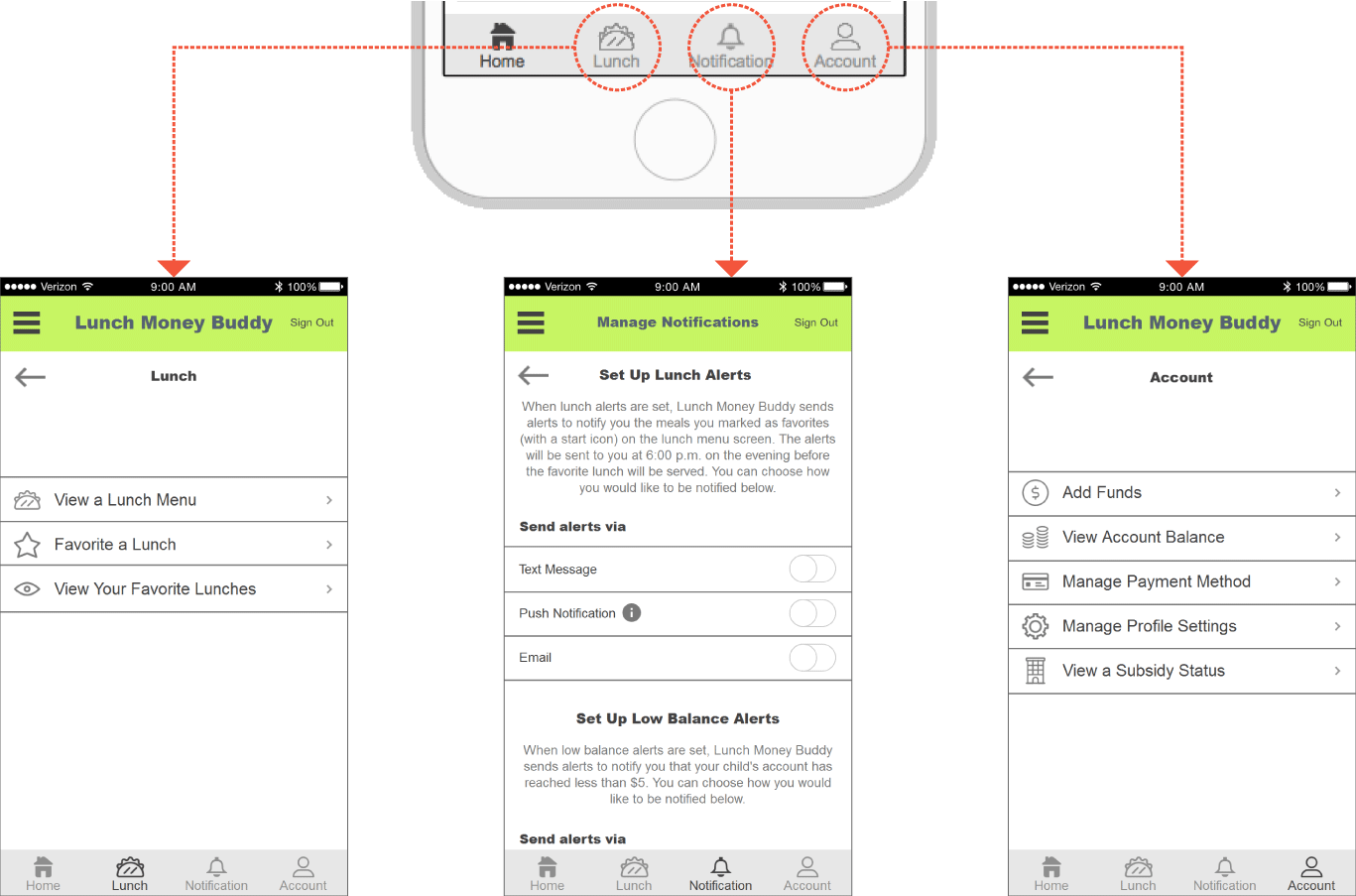
Global Navigation
Everything on the app is made available through the global nav, compensating the users who may have trouble using the hamburger menu. The notification is one tap away from the home screen.
Hamburger Menu
- A hamburger menu is offered for users with more experience using a smartphone.
- All three tasks can be performed on this screen. Three access points are made available to busy users.
- Manage notification lets users set up lunch and low balance alerts. This option is prepared with busy parents in mind.
The tasks are categorized by subject shown on the global navigation.