The table below illustrates the overview of the task results.
ANALYSES & FINDINGS
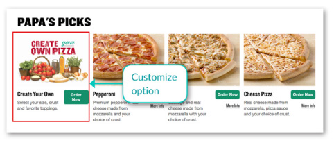
Task 1: Customize Pizzas
FINDING 1 (severity 4 + frequency 3 = critically 7)
Novice users have difficulty finding the option to customize a pizza.
ANALYSIS
Three out of three participants had a problem spotting the customize option on the Menu Page. The Create Your Own section is placed under the Papa’s Picks category, which may not be an obvious category to be placed under and in user’s sight until scrolled down. One user thought the section is a graphic rather than a clickable section. The section is not prominent enough and buried in other set pizza options. The participant 1 initially went to the Specials page while the participant 3 went to the Ordering page instead of coming to the Menu page for the customize section.
USERS’ VOICE
“It’s not very clear where to customize. That was confusing. It wasn’t like its own header or section, easily at the top of this (page).”
“I looked by that because it didn’t have a pizza on it but…I guess I just thought it was a graphic initially. But, now that I’m looking harder, I see it.”
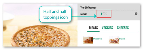
FINDING 2 (severity 4 + frequency 3 = critically 7)
The half and half toppings option often gets missed. Users find the half and half icon too small and not intuitive..
ANALYSIS
Three out of three participants expressed that the half and half option wasn’t immediately apparent—the icon was small and hard to decipher. Also, the icon wasn’t in sight of the user when the user clicked a topping. The user often missed the icon appearing above the toppings selection until he or she scrolled up. The two participants thought the half circle shapes were arrows and couldn’t figure out what those icons do until they actually clicked and saw the topping being placed on the 3D picture. Two participants said that having written descriptions might be helpful in understanding the icon better.
USERS’ VOICE
“Only indication is by the picture. There is no actual verbal text to explain it. I’m down here. When I pressed on that (topping), I’d have to scroll back up to see what this icon was doing. I would have missed it. It (icon) was kind of small too.”
“I would think light or heavy toppings (what the icon means). That would be my first thought. I was thinking of them as arrows. To me when I saw that graphic, it wasn’t intuitive to me that it was initially half and half.”
FINDING 3 (severity 4 + frequency 2 = critically 6)
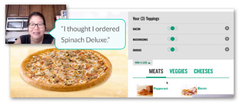
The 3D picture showing what the customized pizza looks like doesn’t always reflect users’ specifications, which often confuses the users.
ANALYSIS
Two out of three participants saw that the 3D picture sometime didn’t match their specified options such as sauce and toppings. When a participant who chose to customize a set pizza—Spinach Alfredo—saw that the 3D picture of the pizza was shown without the Spinach Alfredo sauce, she thought she accidentally selected the wrong pizza. So then, she went back to the Menu page to re-select the Spinach Alfredo but again saw the same 3D picture. She was confused.
USERS’ VOICE
“I wish this picture would reflect what that original picture on a menu looks like. It just looks like a plain cheese so that kind of threw me off. I pressed on the wrong one?”
“So I already clicked no cheese…oh, we should have that graphic with no cheese because the graphic has cheese on it.”
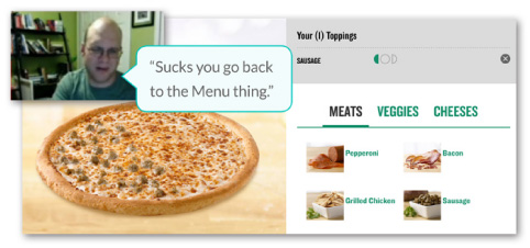
FINDING 4 (severity 3 + frequency 2 = critically 5)
Users find it slightly irritating that they’re taken back to the Menu page every time they’re done customizing a pizza. When they want to order another custom pizza, they would also have to scroll down to get to the customize section.
ANALYSIS
Two out of three participants indicated that it was somewhat frustrating to being taken back to the Menu page when they were done customizing a pizza. Instead of getting an option to stay on the customize page and proceed to creating another pizza, they would have to scroll down to get to the Create Your Own section again on the Menu page to customize another pizza.
USERS’ VOICE
“It’s kind of sucks that you kind of go back to the main menu thing.”
“Now I’m back at the beginning. It’s tiring.”
“You do have to scroll down to get the second pizza. I’d like it if it says one more pizza right up front.”
Task 2: Sign Up For Deals And Coupons Without Registering On Papa John’s
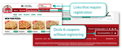
FINDING 5 (severity 5 + frequency 2 = critically 7)
Users don’t expect to be able to sign up for deals and coupons without registering with Papa John’s.
ANALYSIS
Two out of three participants had failed to accomplish this task. One participant was able to complete the task with a prompt from a moderator. The problem seemed to be that the participants tended to believe that they had to create an account in order to receive deals and coupons. Moreover, the link to sign up for deals and coupon was tucked all the way at the bottom right. In contrast, the “Sign In or Create an Account” and “Papa Rewards” buttons were placed at the top of a page where the participants can spot easily; hence, all participants initially clicked those buttons. Two participants said they would just google coupons instead.
USERS’ VOICE
“How does that work though. Usually you do have to…initially I would have signed in. I would create an account to get an email notifications of coupons. I think I would just google Papa John’s coupons and get it on sites like RetailMeNot. They probably would have deals that I don’t have to create an account with Papa John’s because I don’t want to get that kind of junk mail either through text or emails.”
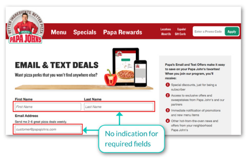
FINDING 6 (severity 3 + frequency 2 = critically 5)
Users are confused which fields on a form are required to fill out.
ANALYSIS
Whether it was the form for signing up for deals and coupons or creating an account with Papa John’s, the required fields weren’t indicated as required; hence, users were unsure of what they were supposed to do. Participants weren’t notified to fill out the required fields until they tried to proceed without filling out those fields.
USERS’ VOICE
“Usually I’m expecting to see an asterisk next to the headers that are required for you to continue on to create this account...”
“It has a first name, last name, and email address field. It doesn’t tell you what is required.”
Task 3: Contact The Corporate Office
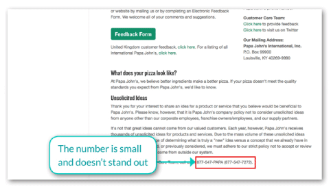
FINDING 7 (severity 2 + frequency 2 = critically 4)
The corporate office number is too small and buried in other text; hence, it’s difficult to find.
ANALYSIS
Two participants expressed that the corporate office number is rather small and difficult to spot. Although all three participants were successful in finding the number, it was not standing out from other copies on the page and may be missed by busy users who may be in rush to find the number.
USERS’ VOICE
“It wasn’t very easy to find but I found it. Didn’t really stick out.”
“The way that the text is laid out, I don’t like it but that’s just me. Underneath all of that then there is a customer care team, which is an 877 number.”