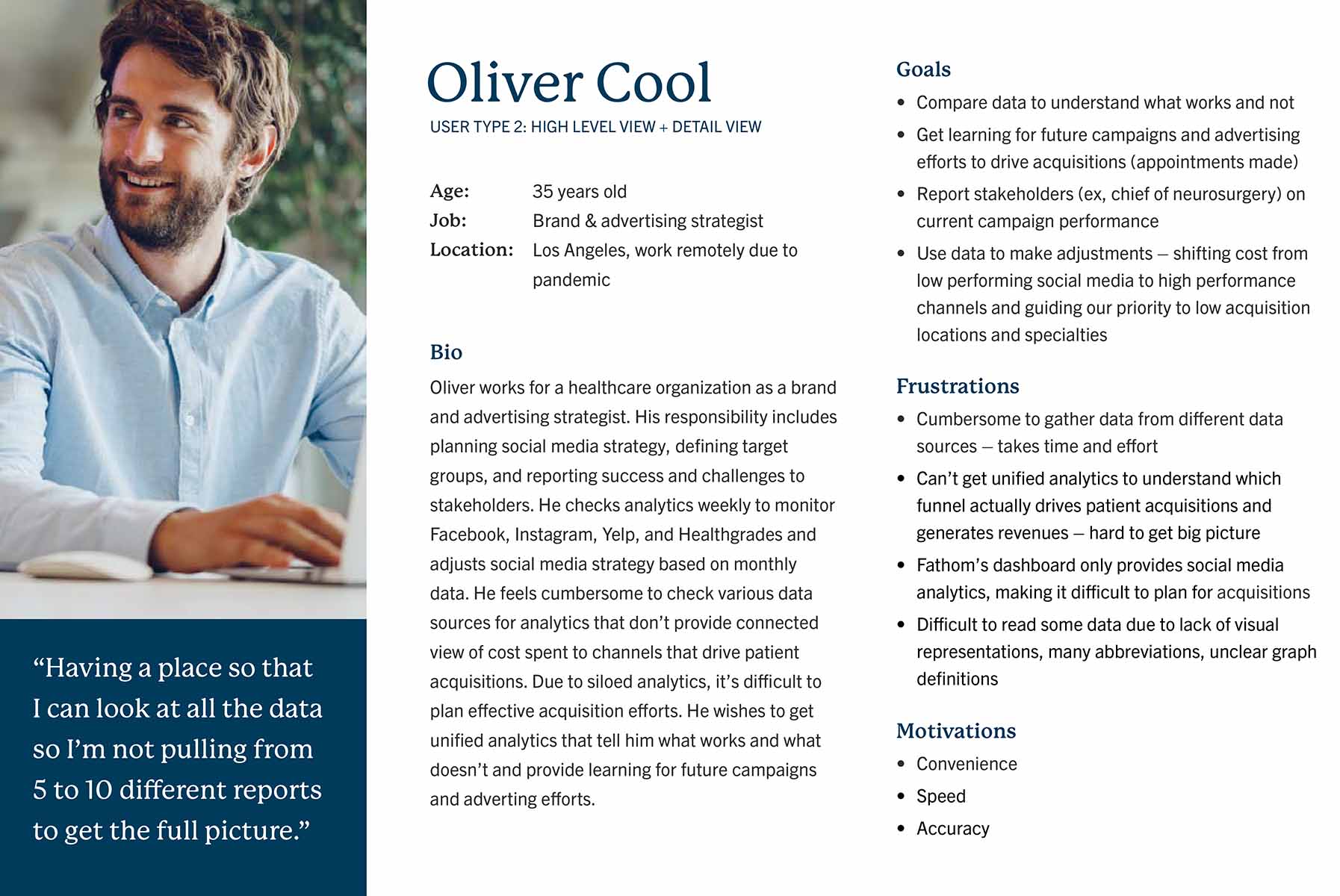
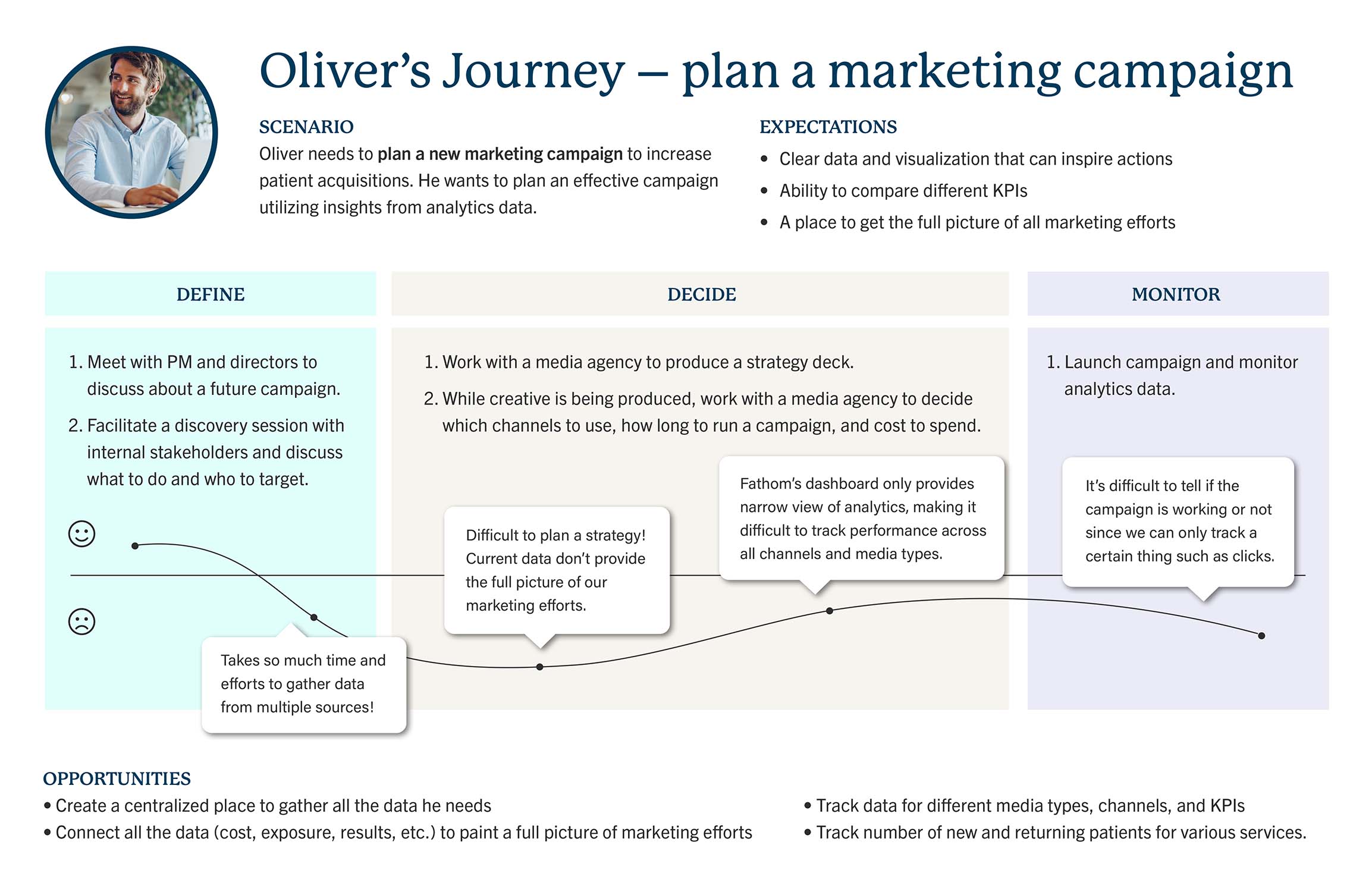
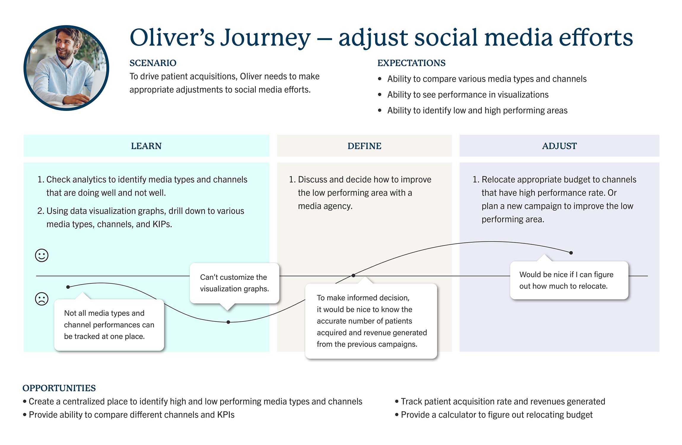
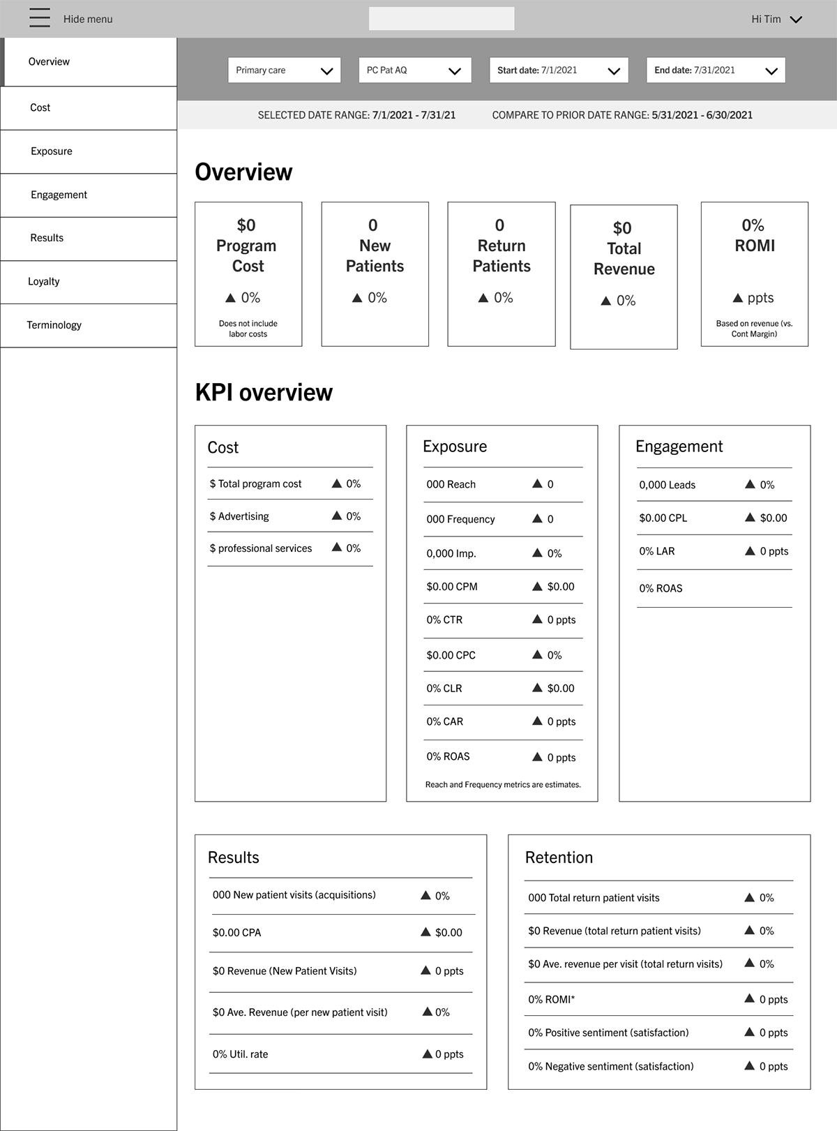
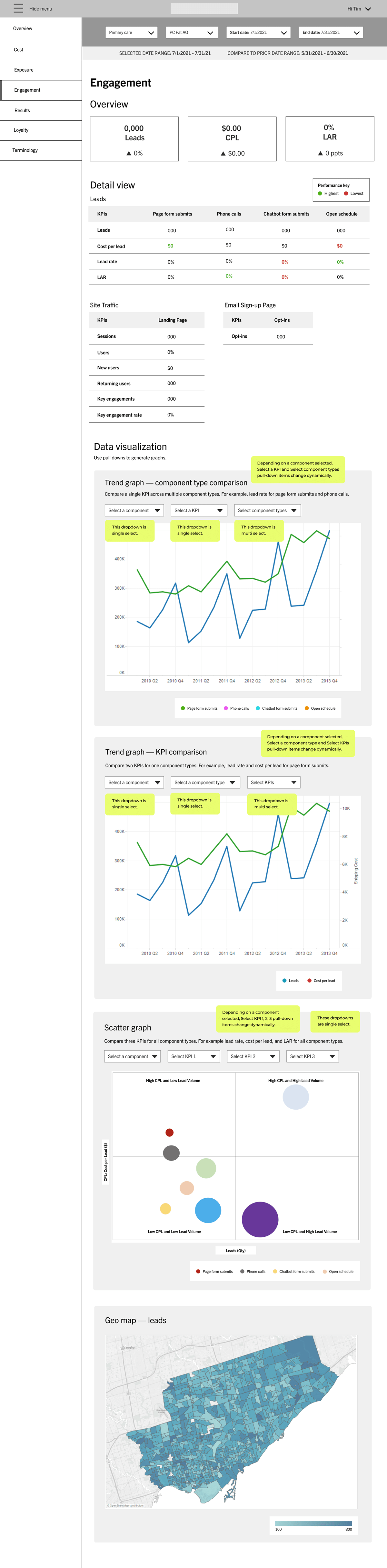
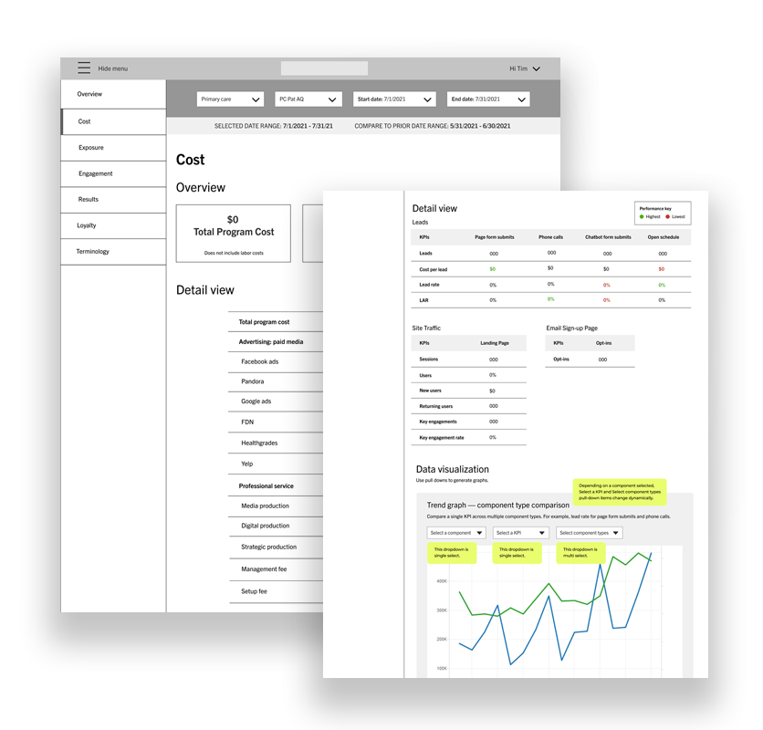
Thumbnail of final wireframes for the Cost and Engagement page.

UMA DASHBOARD

To track performances on social media and campaigns, strategists currently pull data from multiple sources. This is due to siloed analytics and costing strategists time and efforts. Also, current analytics don’t provide a unified view of channels and patient acquisition result. To solve the problems, UMA (Unified Marketing Analytics) Dashboard was created.


OVERVIEW

The project exhibits my ability to conduct user research to solicit user needs, develop actionable deliverables to establish design ideas and turn insights into value-adding features.

PROBLEM

Current way of getting marketing analytics data is time consuming and cumbersome. Disparate analytics don’t provide a connected view of funnels and patient acquisitions. It’s difficult to compare data, get learnings for future campaigns or advertising efforts, report stakeholders on current performance, and make effective adjustments on media buying strategy. UMA Dashboard was created to help address these issues.

ACTION

User Interviews

Due to time constrains and limited resources, I chose user interview as a research method and interviewed two users to understand user needs, pain points, and use cases.

Key findings from the interviews:

  • Users of marketing analytics currently gather data from five to ten different data sources to track media performances.
  • Users can’t get unified analytics to understand which funnel actually drives patient acquisition and generates revenues.
  • It’s difficult to read some data due to lack of visual representations.
  • Users want to see connected data such as cost spent to engagements and to patient acquisitions.

Persona

Based on the user interviews, I turned insights into an actionable persona illustrating user’s goals, needs, and frustrations. The persona helped me focus on user needs and expectations while creating wireframes.

Persona for UMA Dashboard explaining user goals and frustrations.

User Journeys

In the user interviews, I was able to identify steps users took to accomplish tasks. The insights helped me create actionable user journeys that helped to produce useful content, seamless page flows, and valuable features.

RESULTS

Overview final wireframe
Thumbnail of the final Overview page wireframe.
Engagement final wireframe
Thumbnail of the final Engageent page wireframe.

How I solved the problems

  • Removed cumbersome data gathering activity by providing unified data (cost spent to retention) for specific date range.
  • Displayed overperform and underperform channels in a table, allowing quick scanning of data.
  • Allowed multi channel comparisons for a specific KPI in a trend graph, providing ways to visualize channel performance.
  • Allowed multi KPI companions for a specific channel in a trend graph, providing ways to visualize KPI performance.
  • Provided result tab displaying new patient visits and new patient telehealth visits for specific date range, providing the full picture of a specific marketing effort.
SEE THE WIREFRAME SEE THE PROTOTYPE

RETROSPECTIVE

Though I was successful in meeting user needs and expectations uncovered in the user interviews, the design isn’t fully user centered until I test it with users. A next step is to test with users and integrate the design.