DASHBOARD
Design an accounts payable dashboard offering a comprehensive overview of business performance, enabling users to delve deeper for detailed insights.
Design an accounts payable dashboard offering a comprehensive overview of business performance, enabling users to delve deeper for detailed insights.
Tasks
As the company expanded into the accounts payable (AP) sector of accounting, I was tasked with designing a user-friendly dashboard to serve as the homepage and a gateway to different areas of the AP platform.
Disconnected systems and decentralized workflows in AP platforms lead to inefficiencies and limited visibility into financial performance. There was a need for a centralized tool that offers quick access to financial snapshots, improving work efficiency and enabling better decision-making.
By consolidating key AP data—such as invoice statuses and discounts captured—into a unified dashboard, we saved roughly 50% of the time typically spent on manually investigating AP elements.
By creating a dashboard that serves as a gateway into different areas of AP, we reduced time on task by up to 50%.
*Projected/estimated value
To inform the dashboard design, I conducted a quick competitive analysis to identify common AP dashboard content and primary user groups:
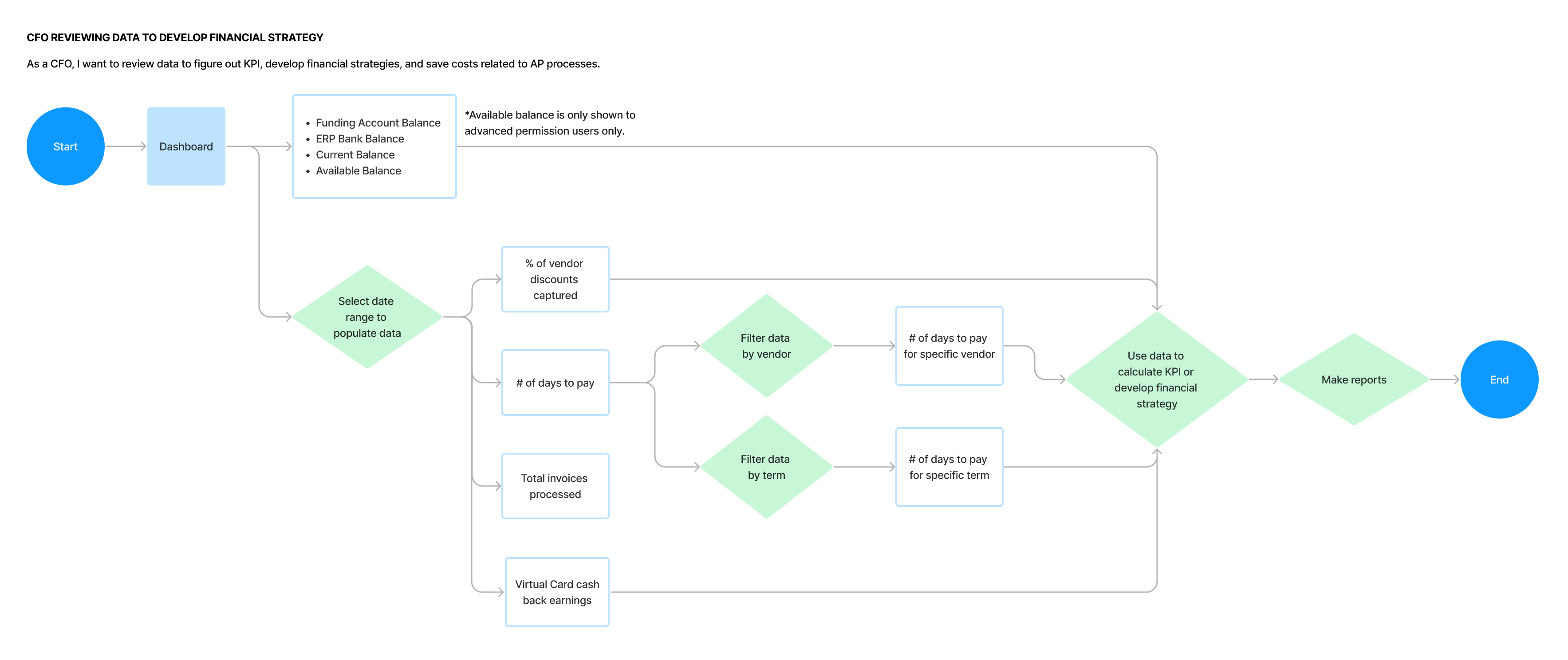
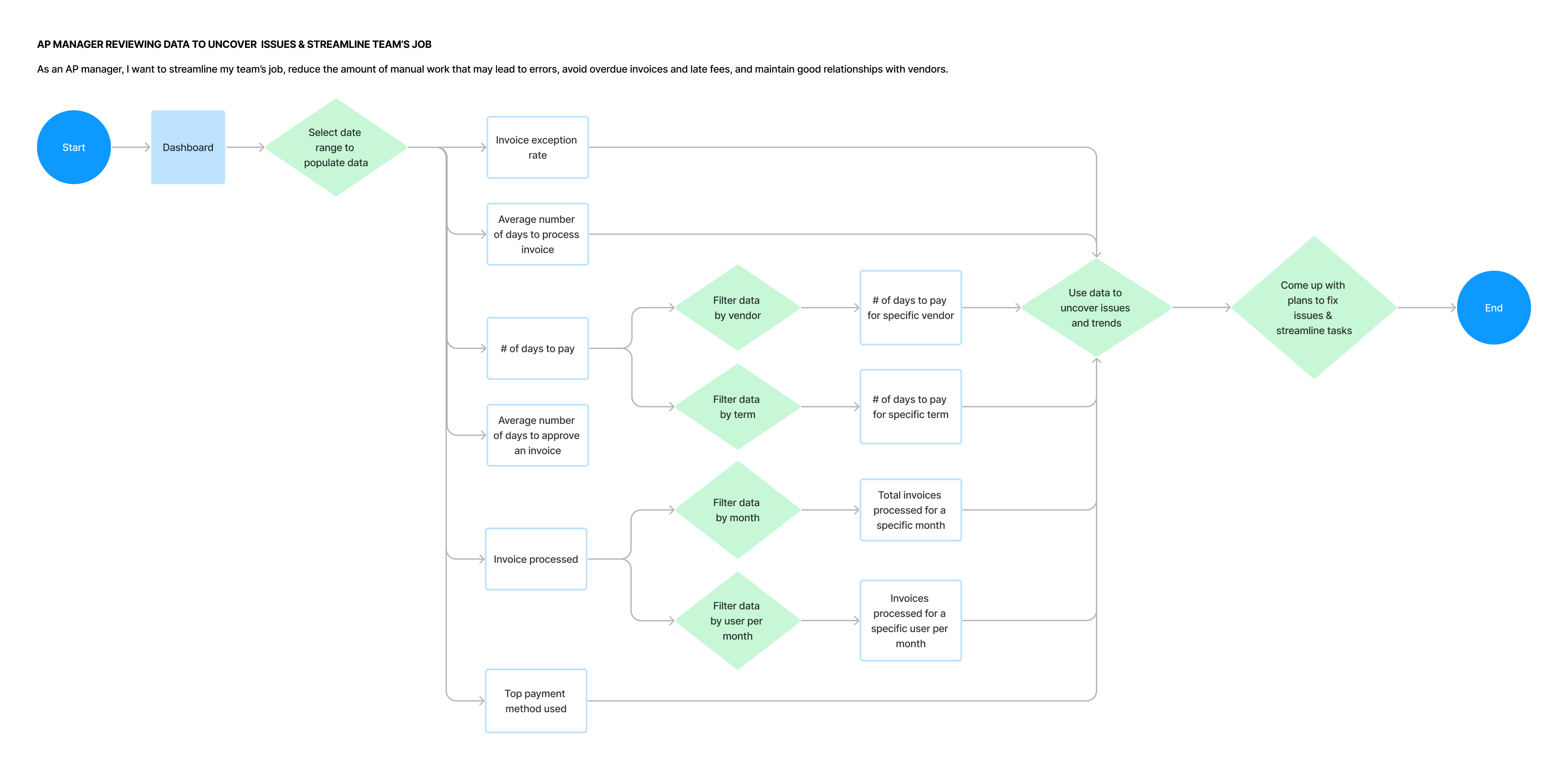
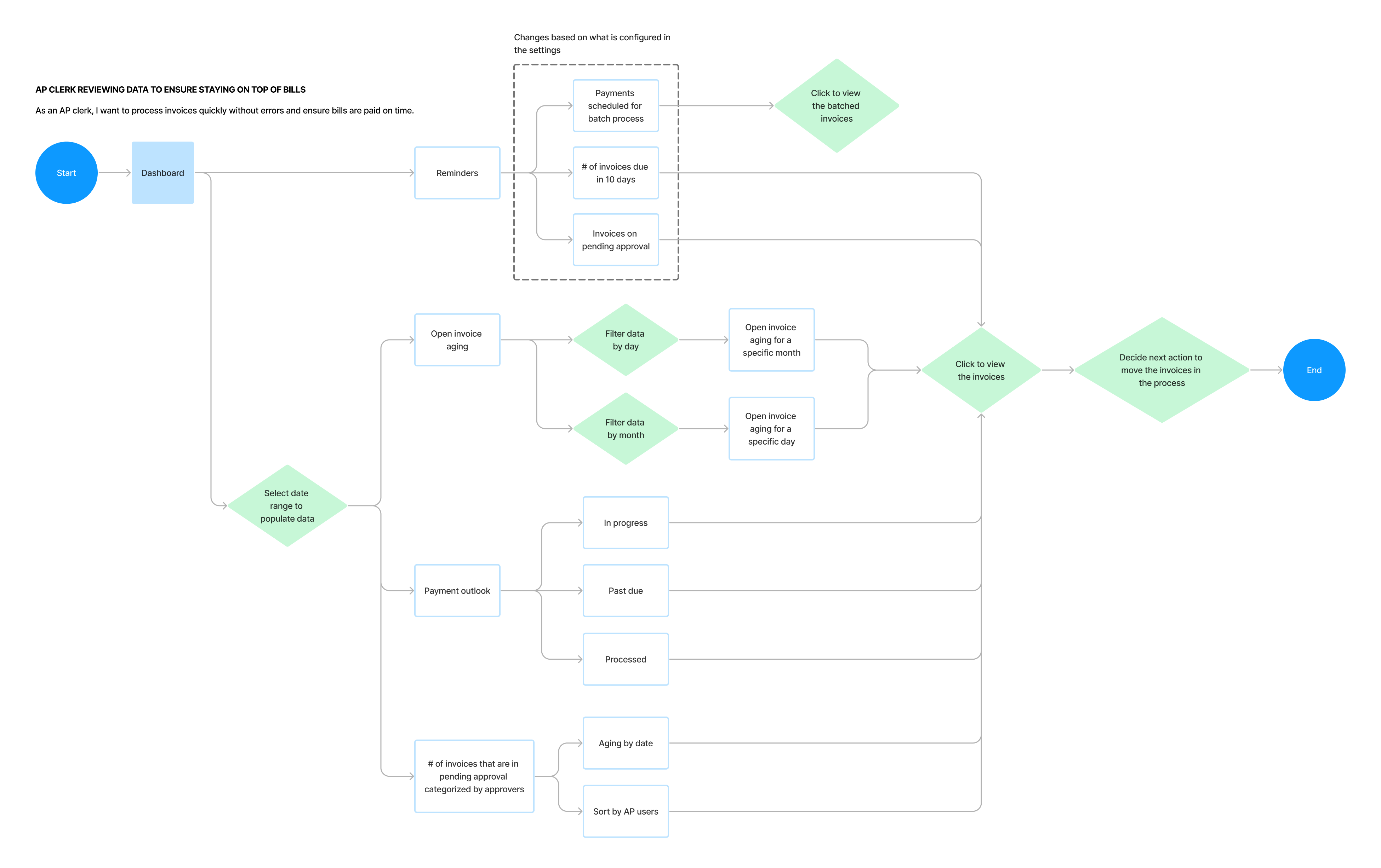
To understand how the data is used, I generated user stories and flows.
Initially, the expectation was to rapidly produce a dashboard design based on a stakeholder-provided mockup and a brief competitive analysis. Although I had reservations about certain design elements, I proceeded without challenging the stakeholder's assumptions, aiming to satisfy both business requirements and user needs.
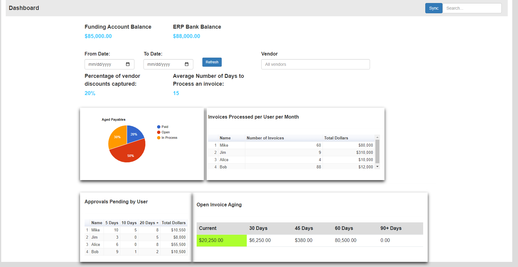
However, this approach led to several issues:
These challenges underscored the importance of critically evaluating stakeholder inputs and aligning design solutions with user needs.

After feedback from the UX/UI team, I recognized the need to reassess the dashboard's scope. I collaborated with fellow designers to:
This collaborative approach with designers and stakeholder led to a more effective and user-friendly dashboard design.
Collaborating with stakeholders and incorporating feedback from internal accountants, we addressed the following key issues:
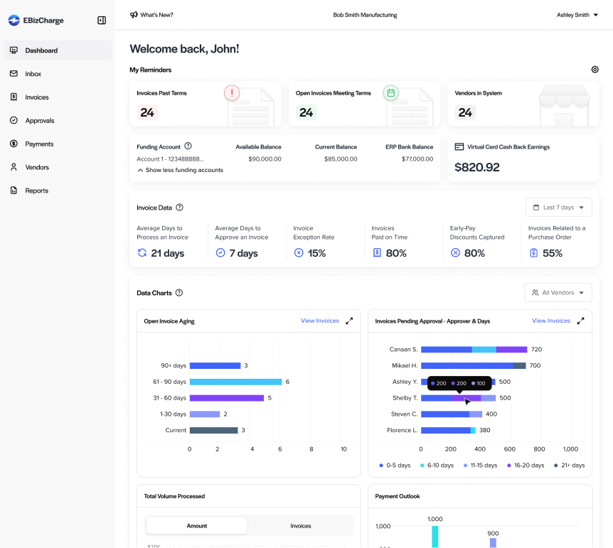
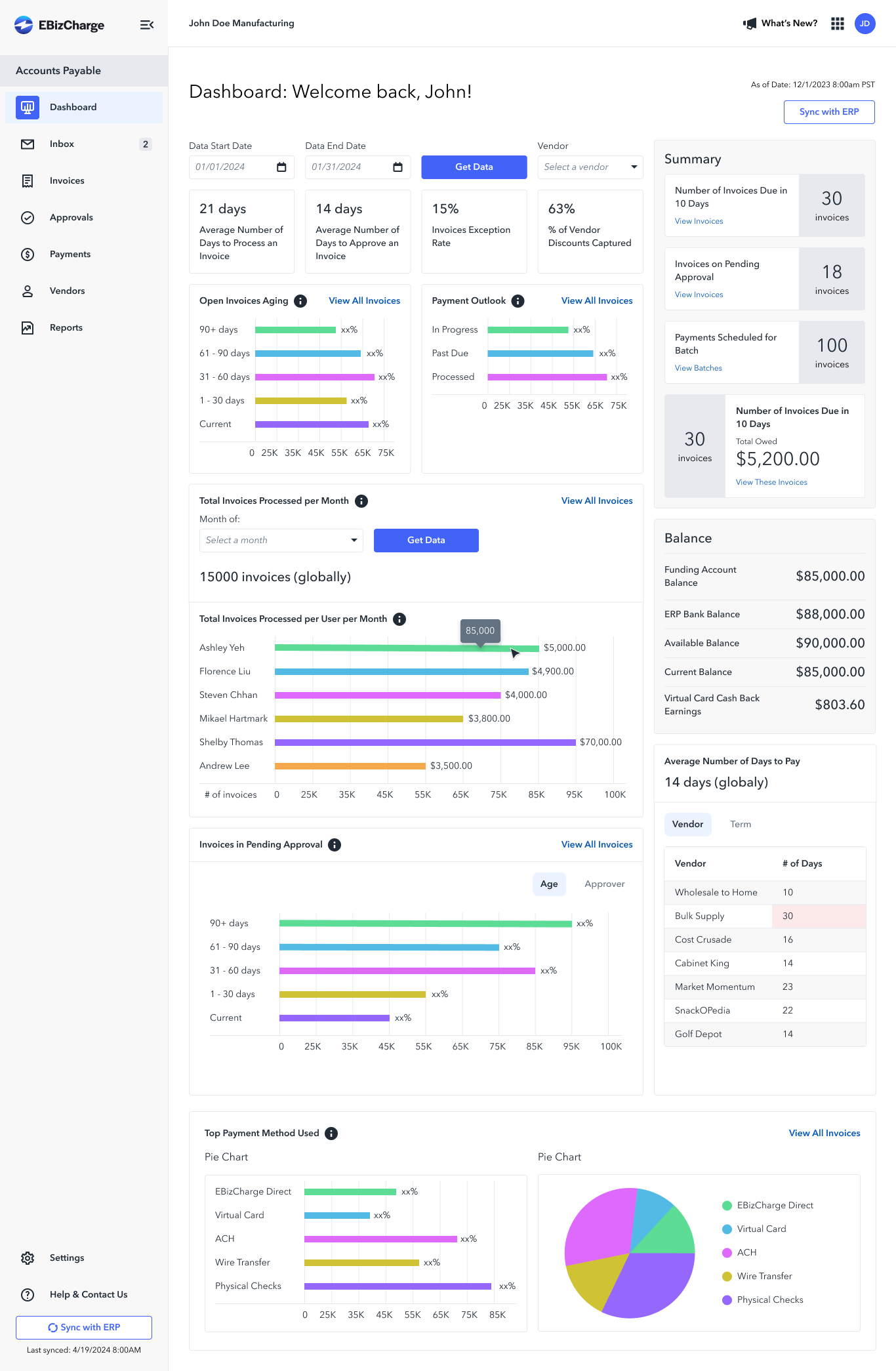
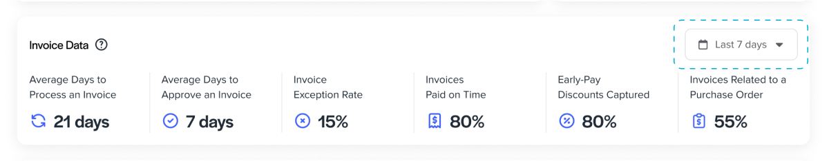
The original Invoice Data section included date range and vendor filters. However, metrics like "Average Days to Process an Invoice" couldn't be accurately calculated for single-day ranges, and vendor filtering often lacked sufficient data. To improve reliability, we replaced these filters with a simpler period selector (e.g., last 7 days).
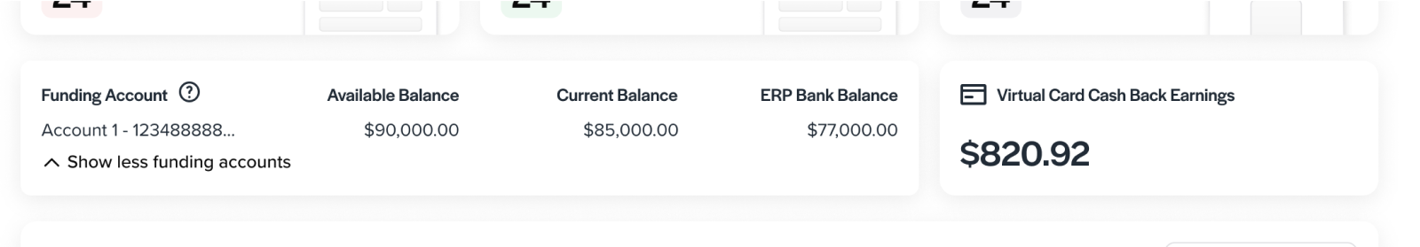
Initially, funding account and virtual card cashback earnings data were presented together and visible to all users. Recognizing that these datasets were unrelated and that unrestricted access posed security concerns, we separated the virtual card cashback data and restricted its visibility based on user permissions.
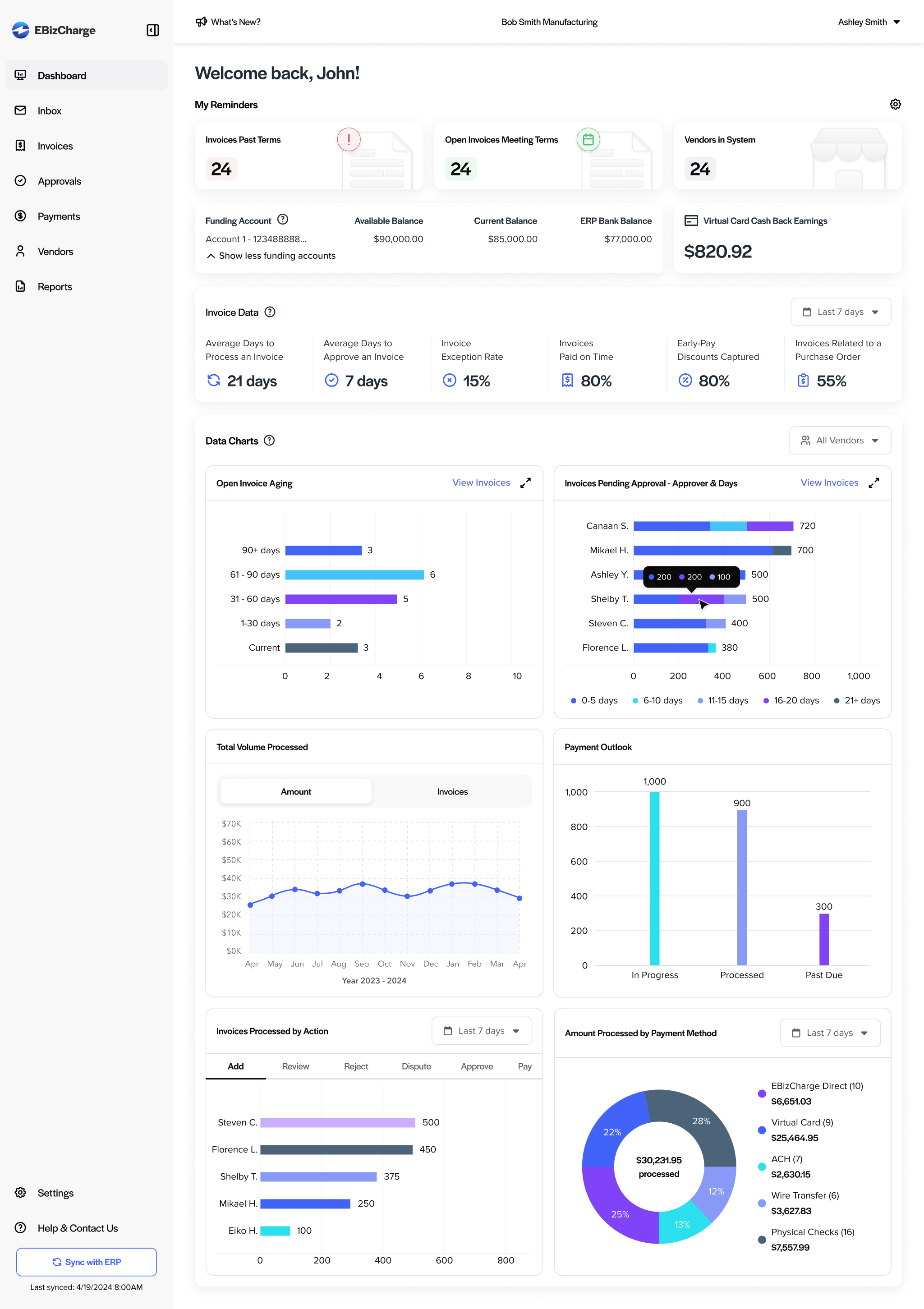
Through refining the Permissions page, we identified that roles such as Approvers, Payers, and Admins often align with AP Manager responsibilities, while Clerks and Accountants correspond more closely with AP Clerk duties. Notably, CFOs review the dashboard for high-level insights, such as visualizing long-term trends and discount utilization.
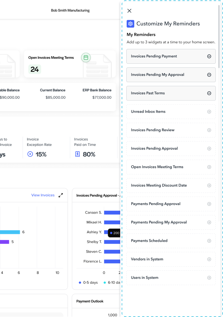
Recognizing these distinctions, we observed that certain dashboard elements—like "Early-Pay Discounts Captured"—were not pertinent to all users, particularly Clerks and Accountants. To enhance relevance and usability, we introduced a Custom Reminders section that displays up to three role-specific reminders. This ensures users see information tailored to their responsibilities, reducing clutter and improving efficiency.
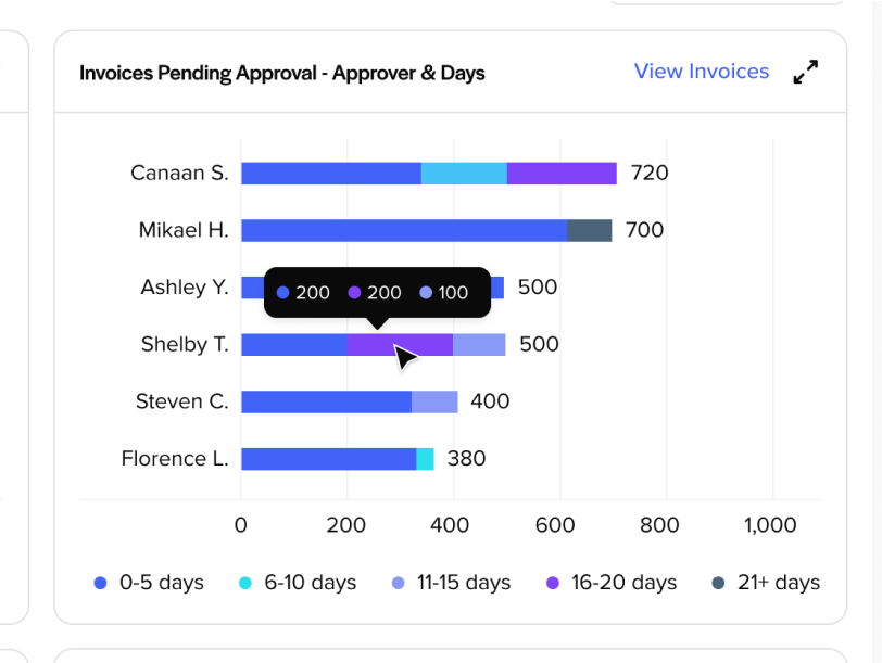
The dashboard's length required users to scroll extensively, hindering quick data access. To enhance usability, we consolidated related data points into combined charts:
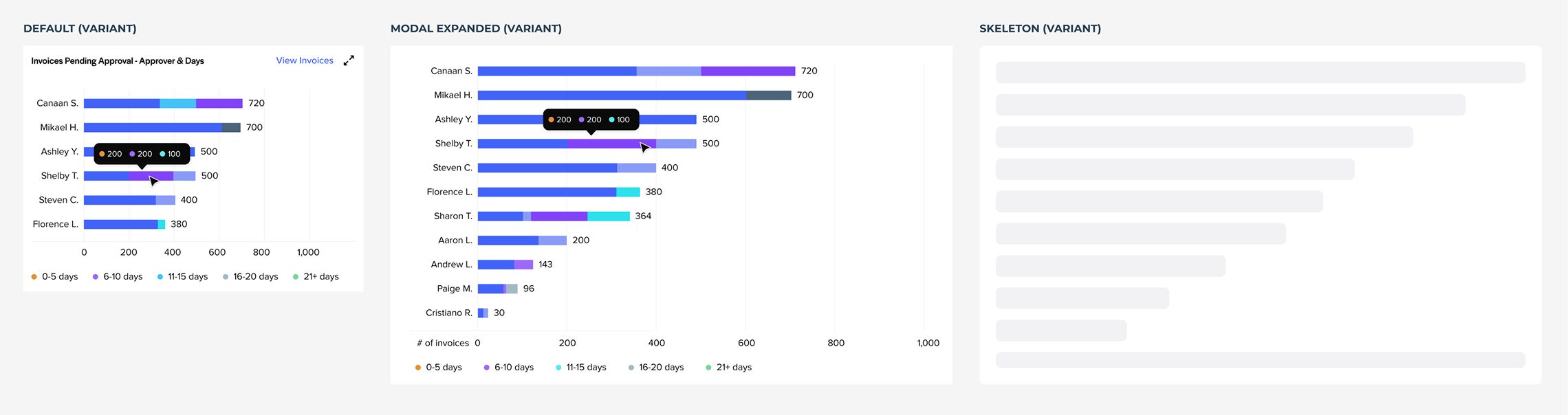
Merged separate charts for invoice counts by days pending approval and by assignee into a single view, providing more detailed insights.
We defined this chart as a component in the design system and created each state—such as default, expanded, and skeleton loading—as a variant.
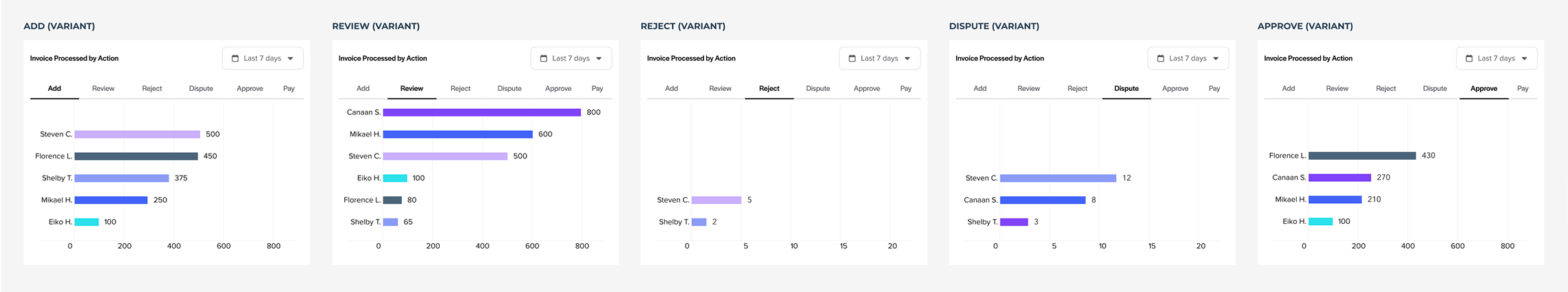
Combined monthly totals and per-user data into a chart displaying invoice counts based on specific user actions per specific date period, offering clearer insights into processing activities.
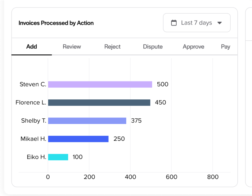
We defined this chart as a component in design system and created each action tab as a variant, ensuring UI consistency.
Project expectations led me to overlook a crucial step: critically evaluating stakeholder content. I’ve learned that questioning requirements and aligning them with user needs is essential. Advocating for more time can help deliver better solutions.
NEXT PROJECT