MULTI-INVOICE FORM
Design an intuitive web form that allows customers to seamlessly pay multiple invoices in a single transaction, while supporting various payment methods.
Design an intuitive web form that allows customers to seamlessly pay multiple invoices in a single transaction, while supporting various payment methods.
TASKS
To complement our existing single-invoice payment form, I was tasked with designing a new form that enables clients to pay multiple invoices simultaneously and choose from various payment methods.
The previously designed multi-invoice payment form was never launched and lacked usability. With the company’s rebranding efforts underway, the form required a visual update to align with the new brand identity and improve usability.
I conducted a brief competitive analysis of similar multi-invoice payment forms to gather insights on effective UI patterns. Utilizing our updated design system, I iterated on various layouts and workflows to enhance usability and align with industry best practices.
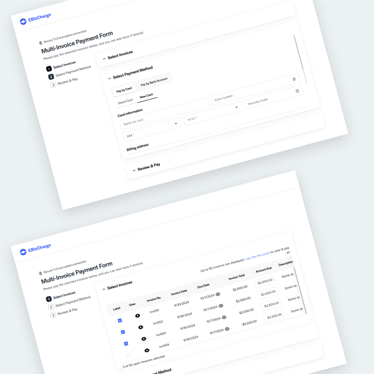
I explored workflows ranging from rigid to fluid—where rigid workflows guide users through a defined, step-by-step process, and fluid workflows offer a more flexible path, allowing users to navigate freely to complete tasks.
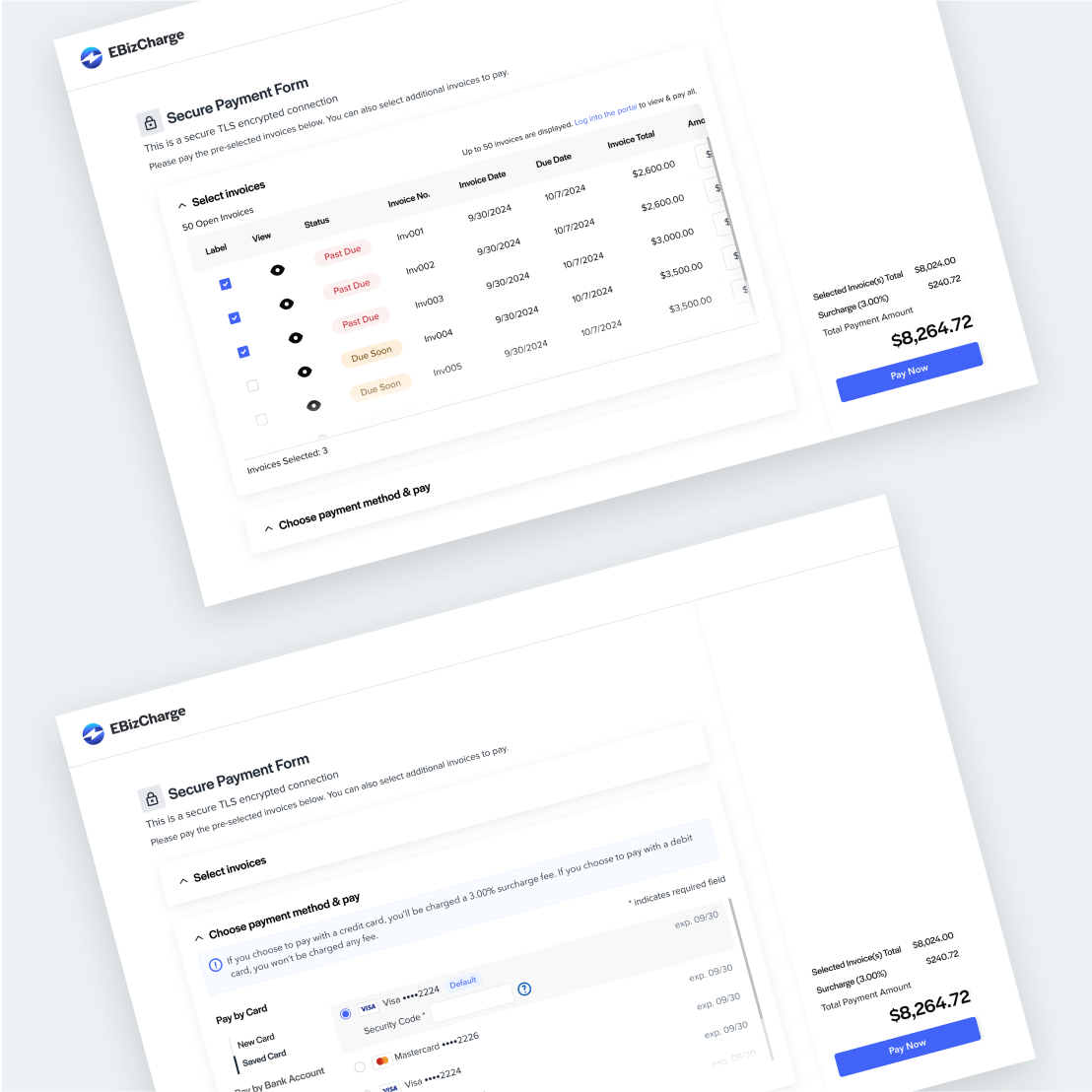
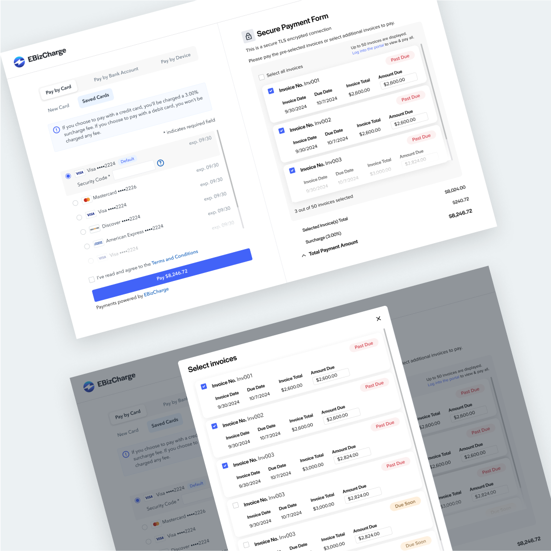
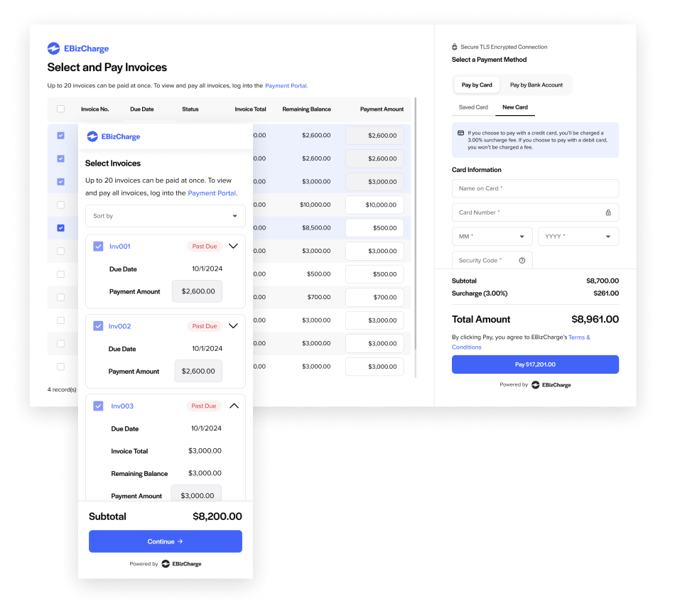
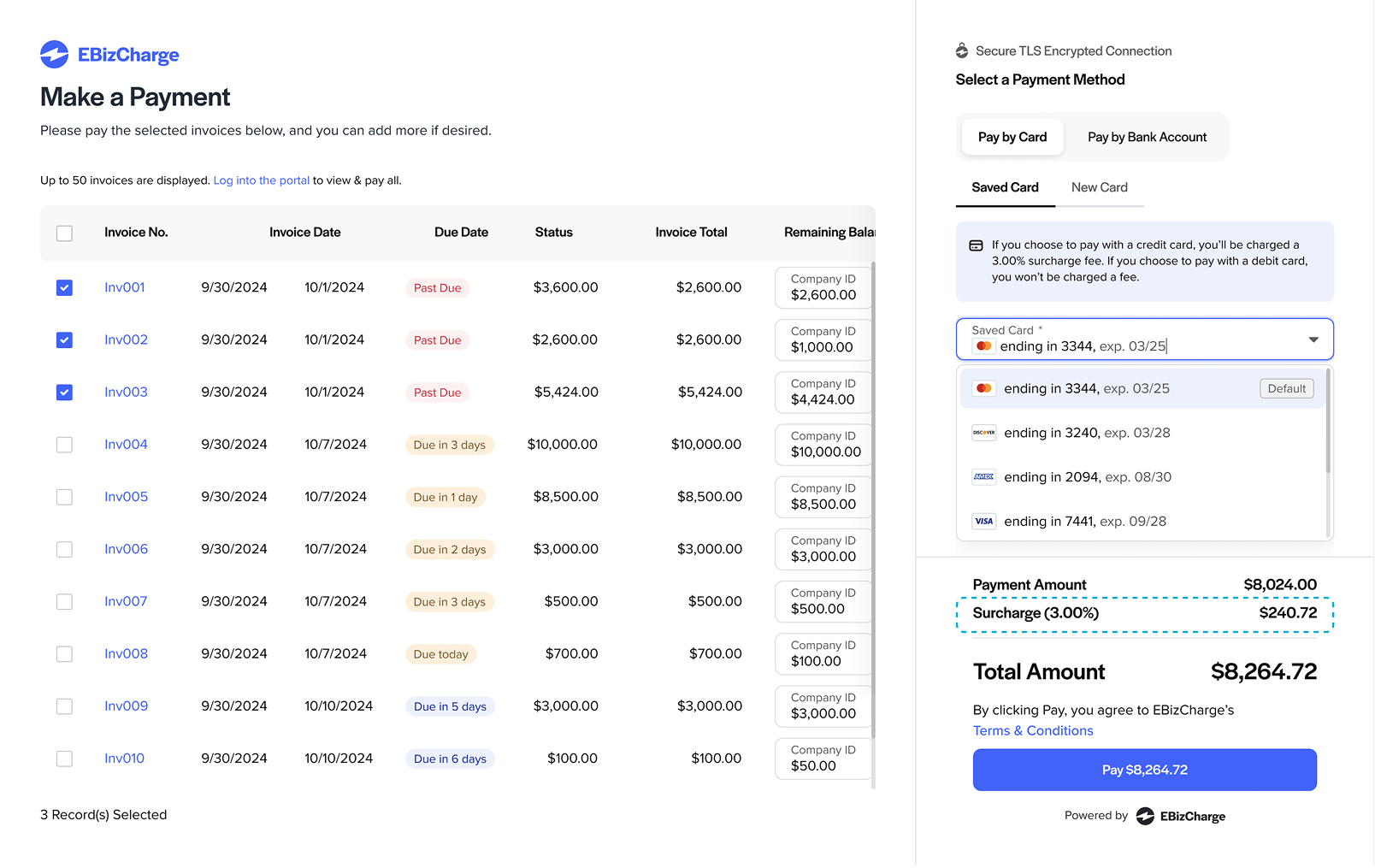
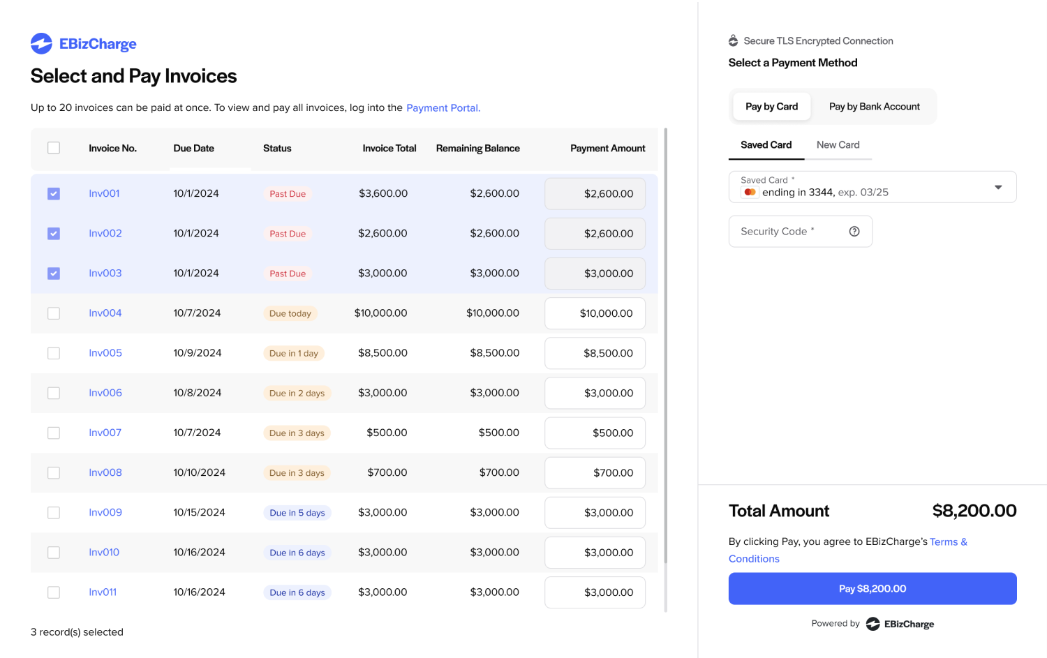
In a UX team review session, I presented five design concepts. The feedback was positive, with two designs selected for further exploration based on their potential to enhance the user experience. In the end, the team chose the fluid workflow option, where the invoice table and payment methods are placed side by side for greater convenience in selecting invoices and a payment method.
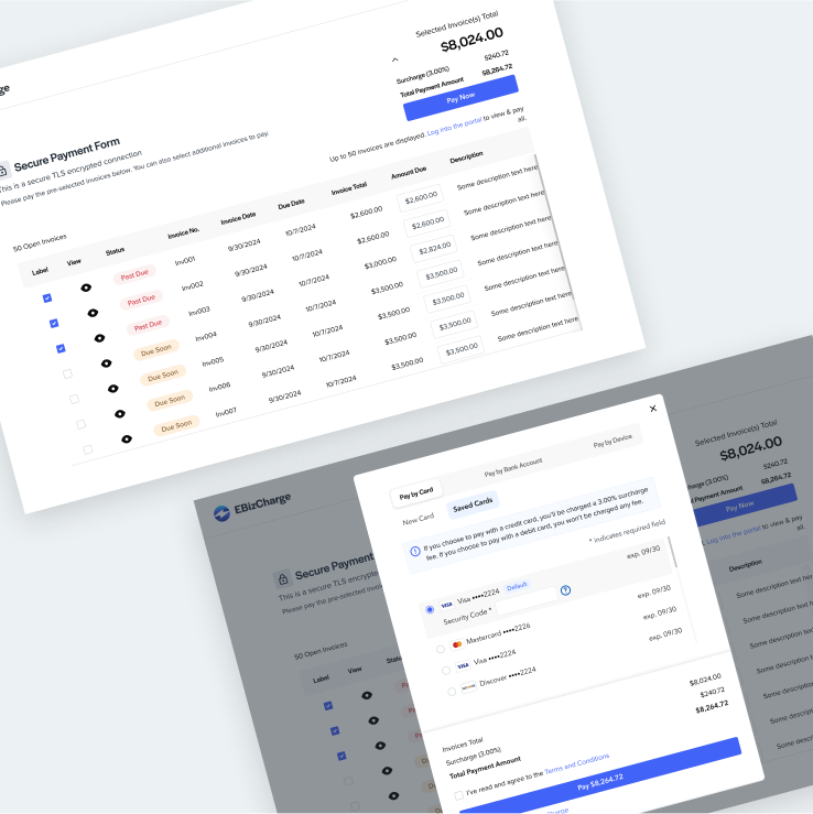
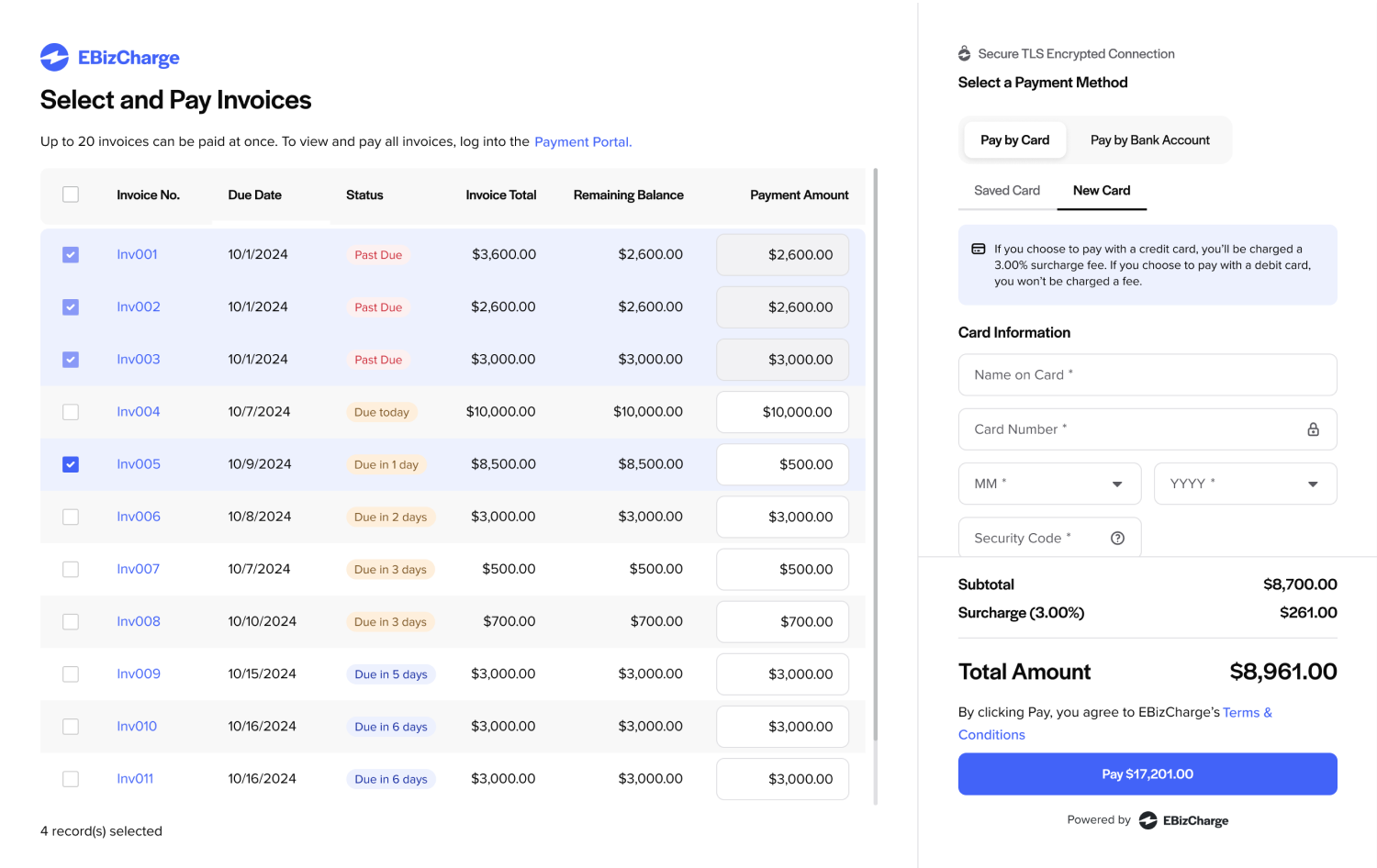
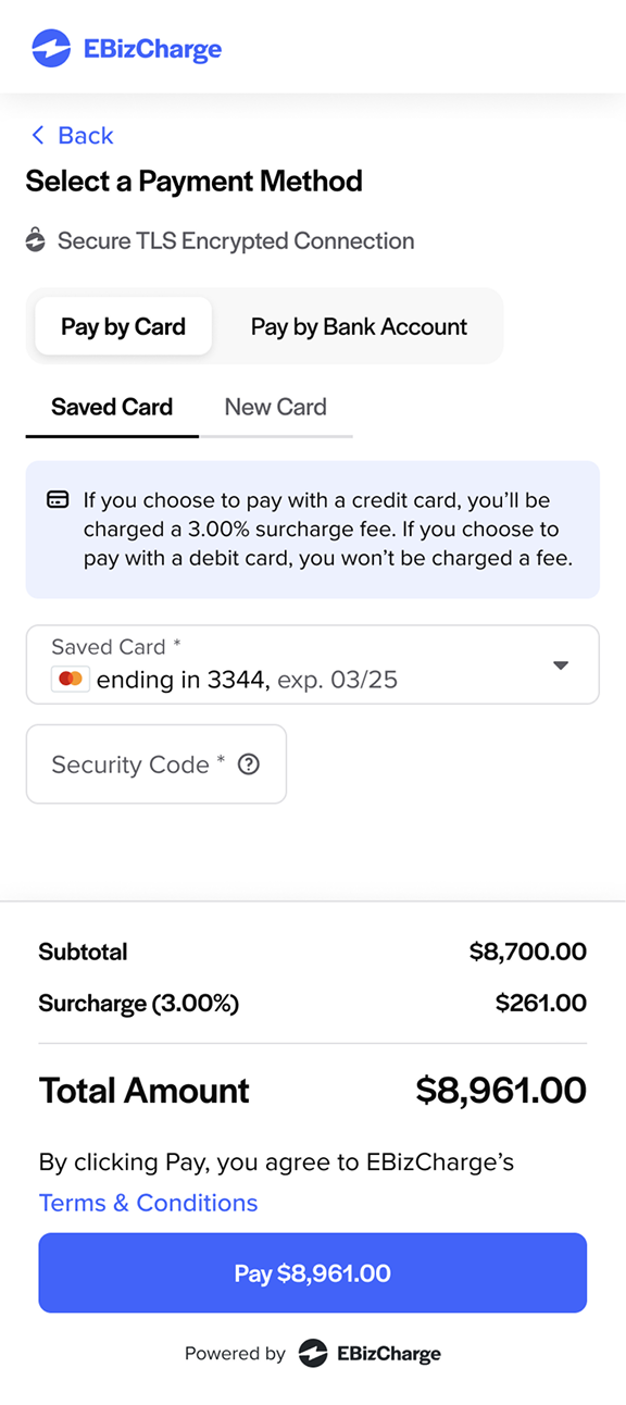
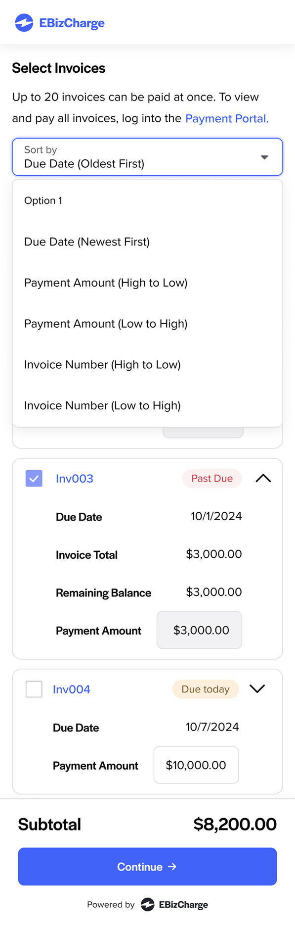
Presenting the final design to the VP of Product Development highlighted the need to reduce table columns to prevent cumbersome horizontal scrolling. Additionally, the CTO emphasized making the surcharge information more prominent.

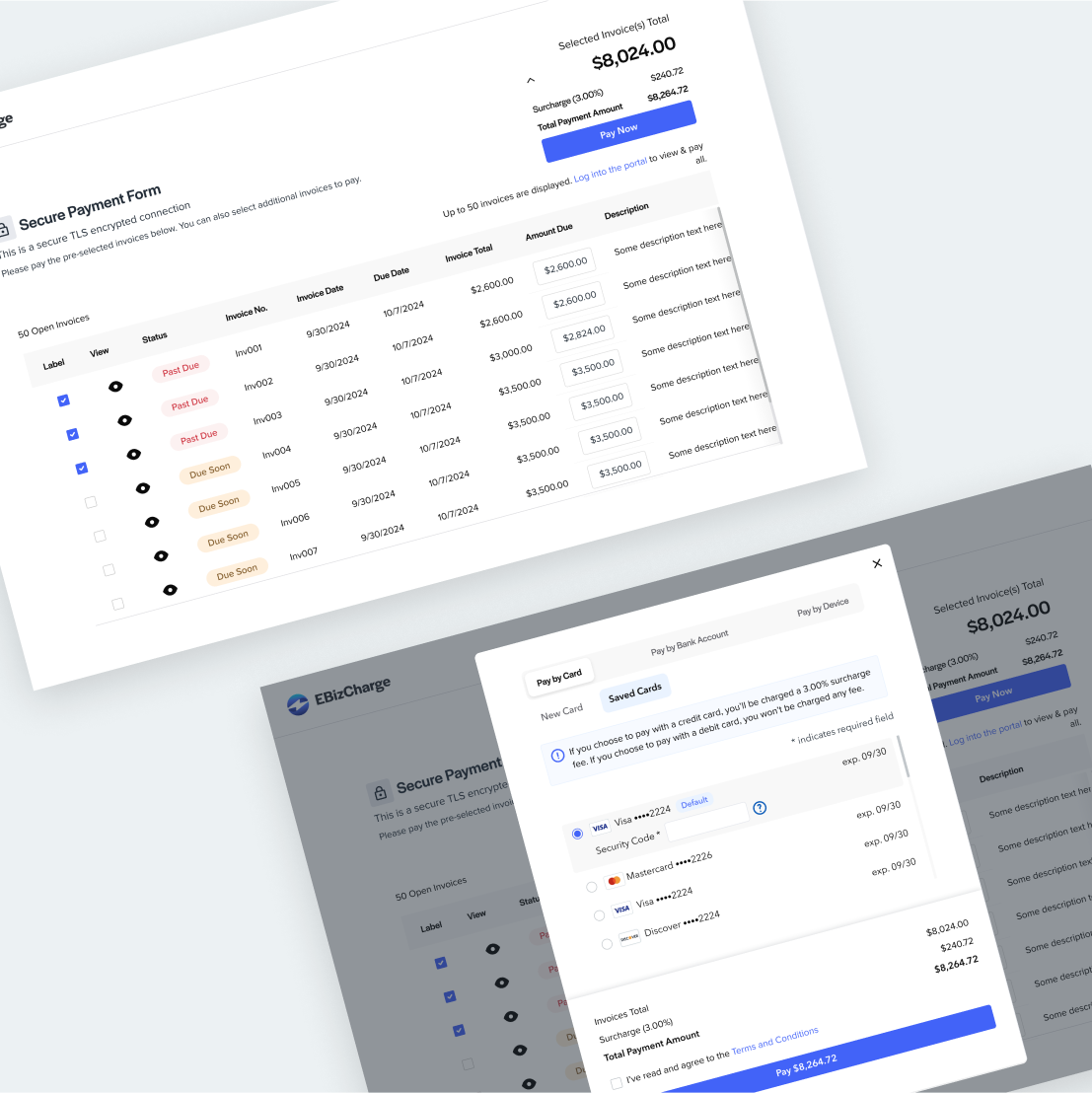
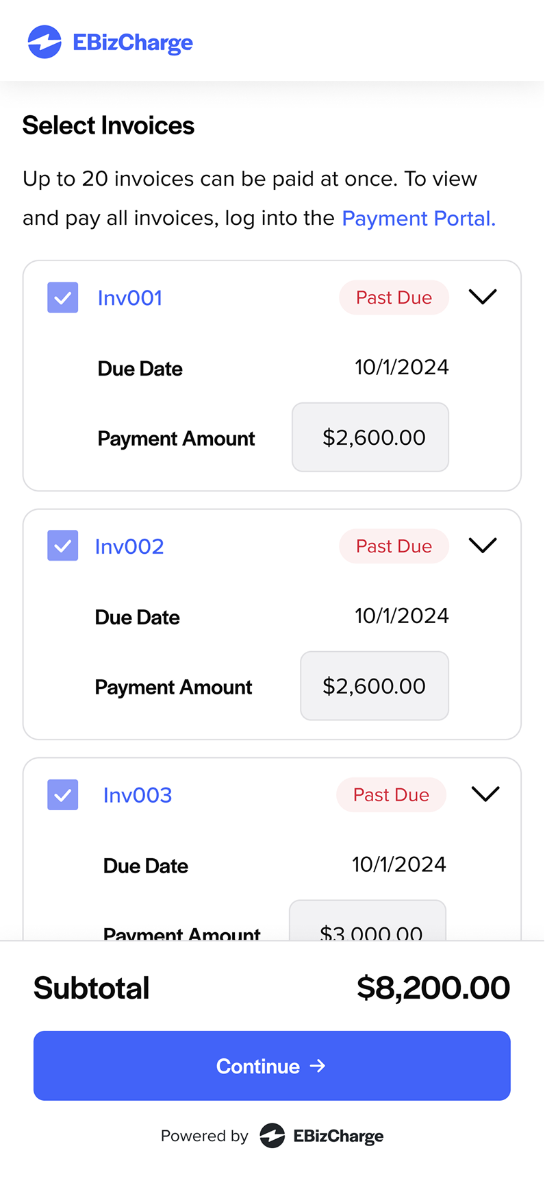
To eliminate vertical scrolling on desktop, I streamlined the content and layout effectively. Adapting this design for mobile posed challenges, which I overcame by implementing an accordion pattern from earlier design explorations. This approach allowed for a compact, user-friendly mobile layout.

To ensure the mobile form's usability, my fellow designer and I conducted usability testing sessions with the Support team, leveraging their direct experience with customer interactions. We focused on evaluating:
Usability testing revealed two key improvements:
Incorporating diverse feedback can be challenging, but asking targeted questions helps clarify intent, align user needs with business goals, and streamline the design process by minimizing unnecessary revisions.