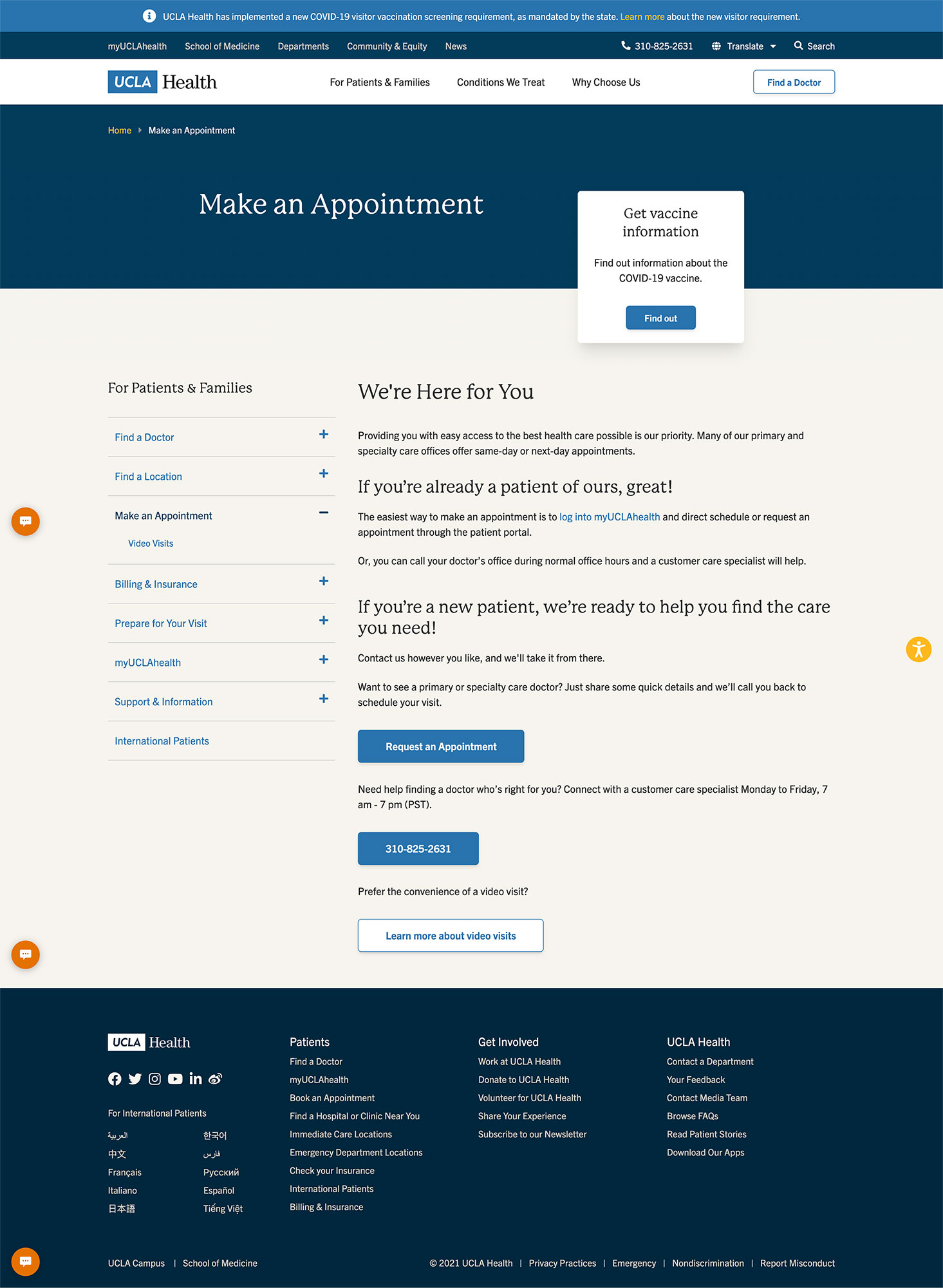
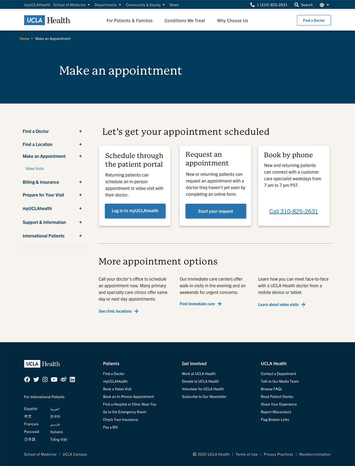
The “Make an Appointment” landing page plays a crucial role in patient acquisition and retention. The previous design lacked a clear visual hierarchy, making the page difficult to scan. The CTA buttons did not provide clear cues about their destinations, leaving users confused.
The project demonstrates my ability to gain useful insights from usability testing and synthesize them into actionable items, which then inform ideation and iterative design.
PROBLEM
The previous “Make an Appointment” page lacked visual hierarchy, clear button labels, and support for content scanning. A new layout, clearer language, and more intuitive UI were needed to improve usability and task completion.
ACTION
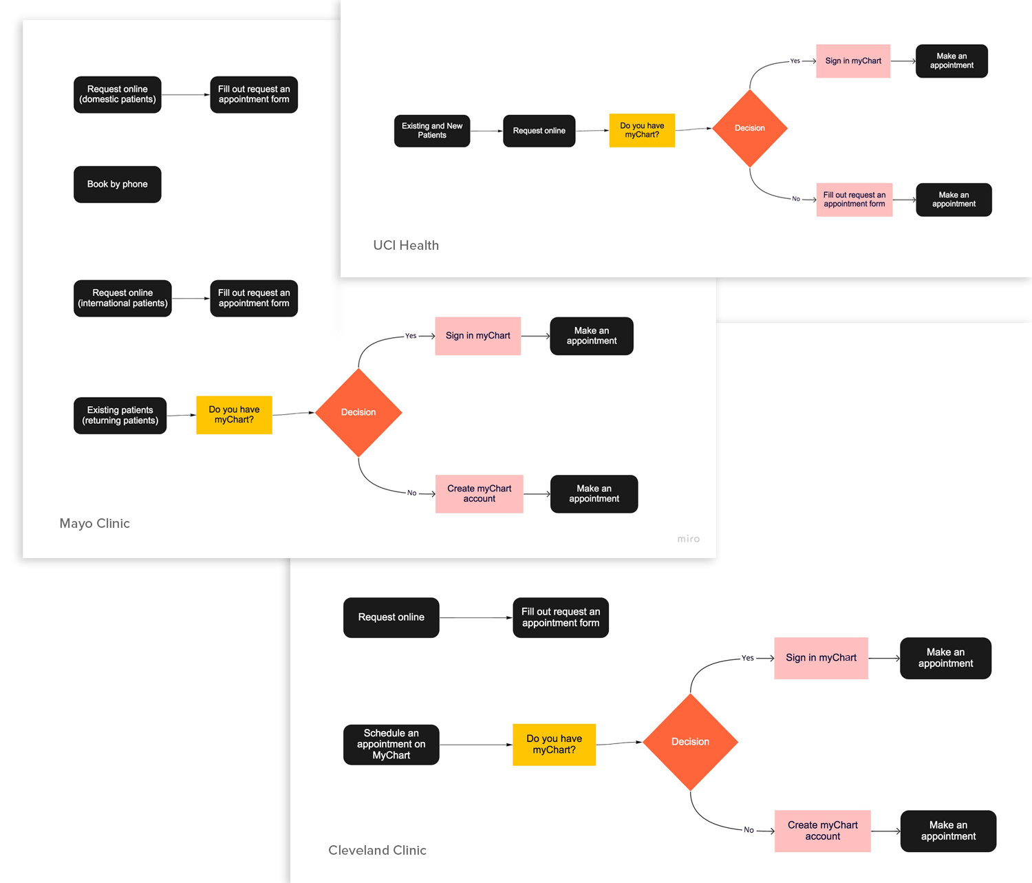
Competitive Analysis
I reviewed the “Make an Appointment” flows of other medical providers and identified common elements:
A phone number to schedule an appointment
A link to the patient portal
A request-an-appointment form
From the competitive research, following common flow was uncovered:
Schedule by phone Call to make an appointment
Returning patient Sign in or sign up for a patient portal
New patient Sign up for a patient portal or fill out a form to request an appointment
Usability Testing the Previous Design
To understand what worked and what didn’t, I tested the original design with five participants.
Usability Test Findings
When asked to make an appointment as a new patient, all participants clicked the “Request an Appointment” button.
When asked to make an appointment as a returning patient, all participants found and used the "Log into myUCLAhealth” hyperlink.
When asked to find a specialty care doctor, no one clicked the blue phone number button. Instead, they used either the “Find a Doctor” hyperlink in the sidebar or the white "Find a Doctor" button in the upper-right corner.
The phone number button was ignored because it was at the bottom of the page and didn’t indicate where it would lead.
Many users also wanted to avoid calling customer service due to long wait times.
When asked to schedule a video visit, most participants clicked the “Video Visit” link in the sidebar and missed the white “Learn more about video visits” button at the bottom of the page.
Some participants were confused that both the sidebar link and the white button led to the same page, despite their labels suggesting different destinations.
General Findings
User Behavior:
Users typically start tasks like making an appointment or finding a doctor online rather than calling customer service. This is mainly to avoid long wait times and to independently research doctors on platforms like Google, Yelp, and LinkedIn.
Users only call when they’re unable to complete a task digitally.
When searching for a doctor, the most important criteria are location, patient reviews, and profile photos.
Users are more willing to travel for specialty care doctors than for primary care doctors.
In general, making an appointment with UCLA Health doctors:
Is somewhat straightforward.
Cannot be completed digitally by new patients without speaking to a customer care specialist.
Is frustrating due to long wait times for customer service.
Is often unsuccessful because patients miss follow-up calls after submitting the request-an-appointment form.
Is challenging since the myUCLAhealth portal does not allow patients to choose a specialty care doctor.
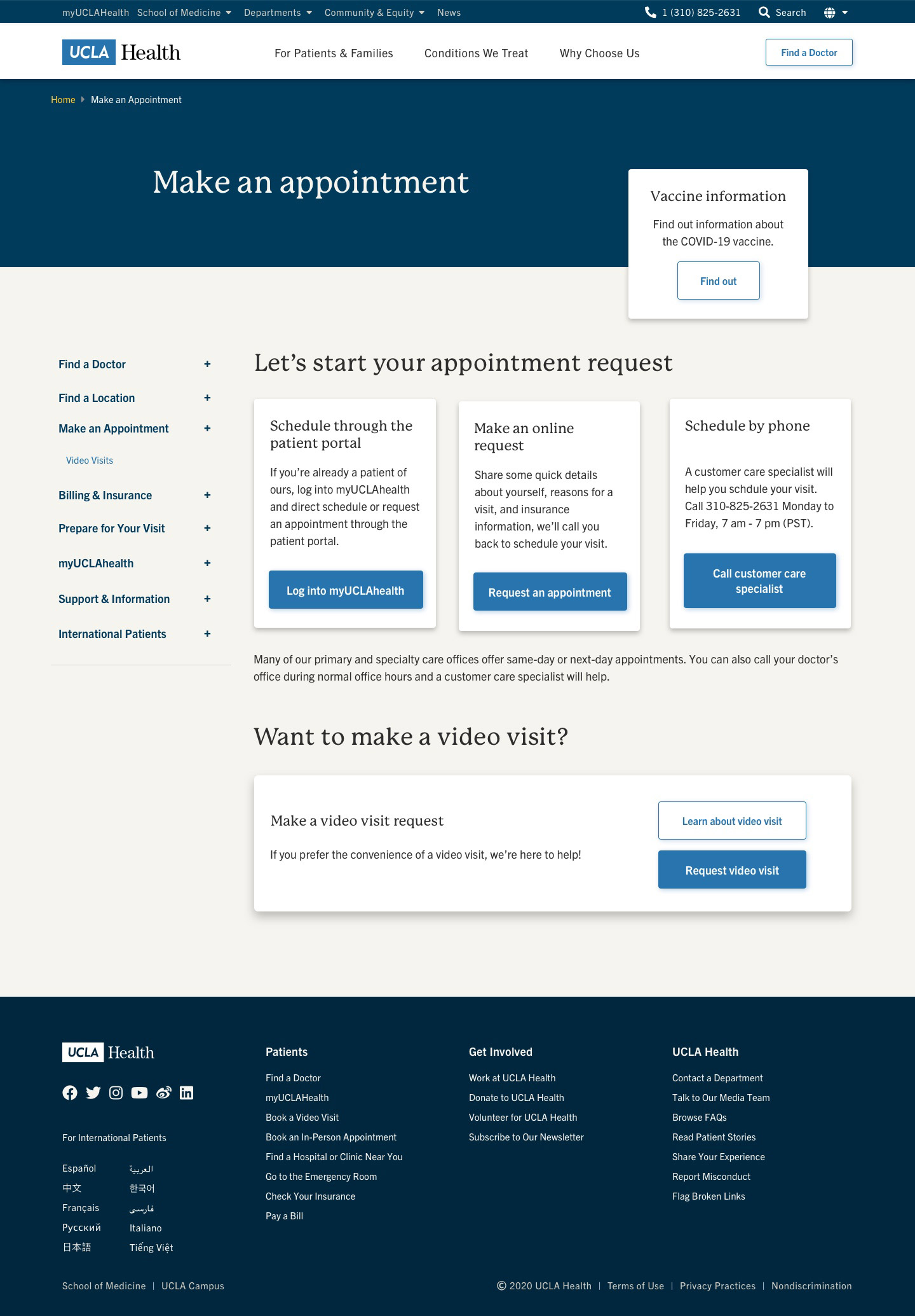
Rapid Prototyping
With insights gained from usability testing, I began developing prototypes and identifying the final solution.
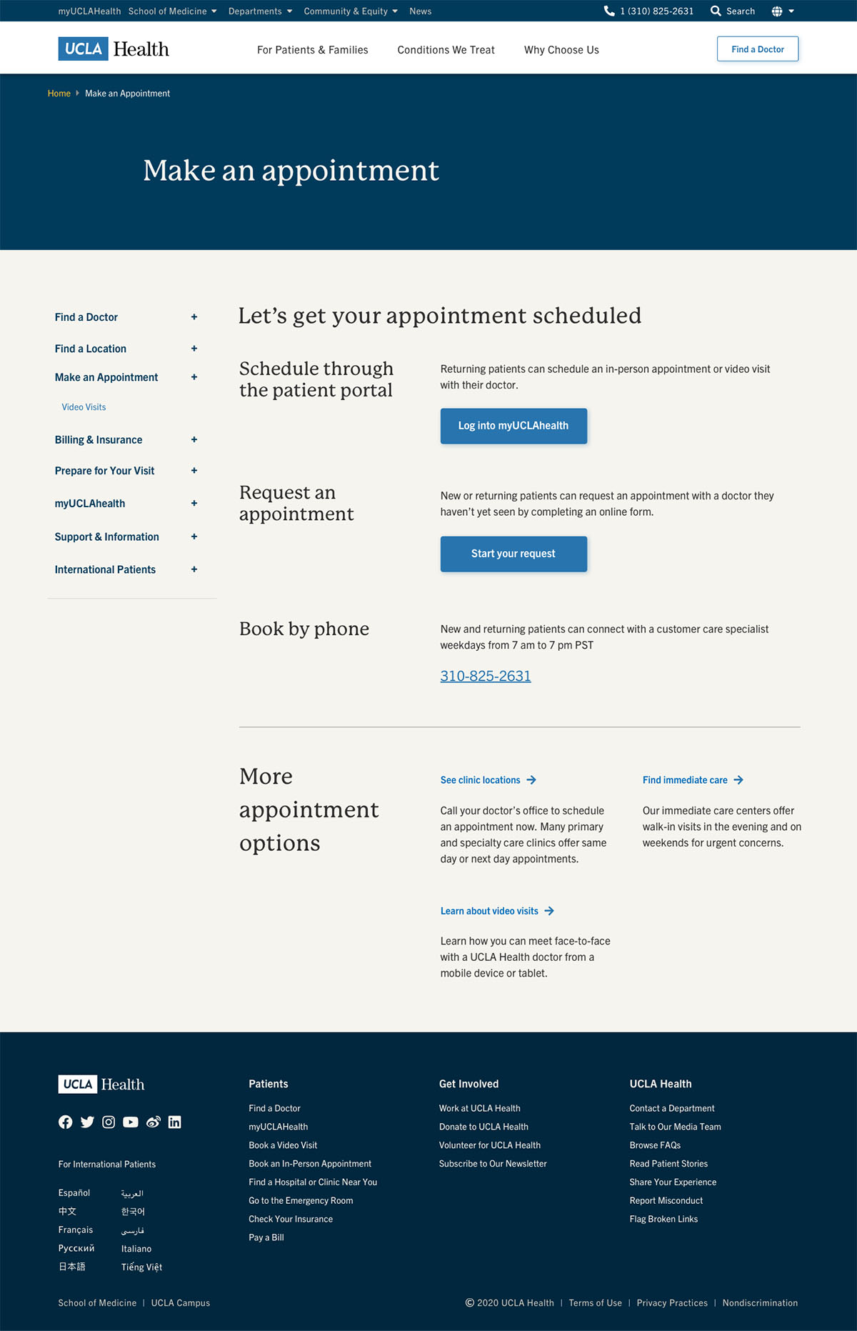
Although many users preferred not to schedule by phone, calling a customer care specialist was sometimes necessary. However, the phone number was often overlooked due to its placement below the fold. To address this, the phone number was moved higher on the page as one of the appointment options.
Instead of separating CTAs by patient type (returning vs. new), they were restructured based on appointment methods—such as scheduling through the portal or using an appointment request form.
CTA cards were used to represent appointment methods, since the appointment request form was used by both new patients and returning patients looking to establish care with a new doctor.
To increase visibility, the video visit option was redesigned as a CTA card.
To reduce confusion between the “Video Visit" link and the “Learn about Video Visits” button, the two were directed to different pages:
“Request a Video Visit” links to the appointment request form.
“Learn about Video Visits” links to an informational page.
Usability Testing the New Design
I tested the new design with five participants.
Make an Appoitment New Design Findings
Users found the title “Make an online request” unclear.
Users were hesitant to click the blue “Request an Appointment” button when trying to schedule with a specialty care doctor, as they first wanted to identify the right doctor.
Users preferred to call when requesting an appointment with a specialty care doctor because they felt more secure speaking with a person rather than completing the process online.
Users felt more comfortable clicking the “Request an Appointment” button on a doctor’s profile page, as they had already chosen the doctor they wanted to see. So, we moved the button to a doctor's page.
Users only called customer care specialists when they were unsuccessful in scheduling appointments online.
Users were hesitant to click the “Call Customer Care Specialist” button on desktop; instead, they dialed the number manually.
When users clicked the blue “Request Video Visit” button and were taken to the same appointment request form as for regular visits, they were confused by the inability to specify the type of visit they wanted.
Note: One user attempted to make an appointment with an ophthalmologist through the myUCLAhealth patient portal but was unable to do so because she hadn’t yet established a relationship with an ophthalmologist at UCLA Health. She was very confused and unsure of what to do. She didn’t realize she needed to fill out the appointment request form to establish care with a new doctor. She assumed she needed a referral from her PCP, even though she had PPO insurance.
RESULTS
Idea 1Idea 2
How I Solved the Problems
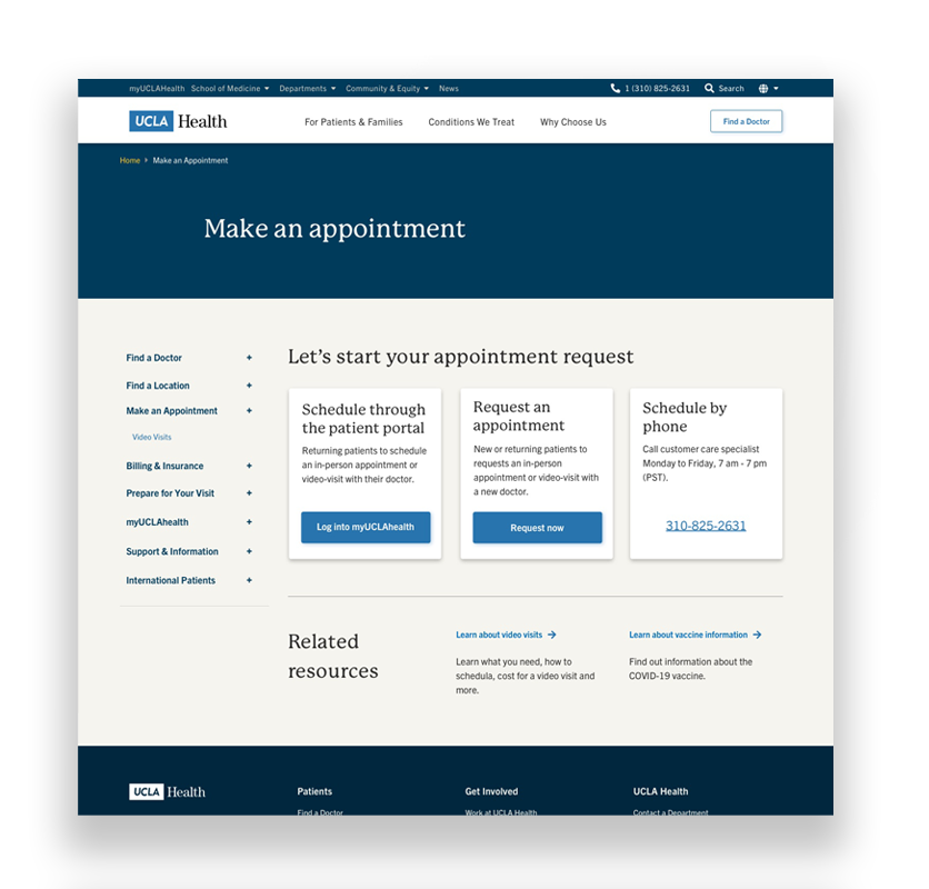
Changed the middle CTA card title to “Request an Appointment” to clarify the action. The previous title confused some users due to the word “online,” which some interpreted as referring specifically to a video visit.
Shortened and clarified descriptions for the CTA cards, as usability testing confirmed that users tend to scan rather than read.
Kept the “Book by Phone” CTA card at the top. While previous testing showed that users often avoid calling customer service, some preferred to call when scheduling with a specialty care doctor.
Replaced the “Call Customer Care Specialist” button with a clickable phone number link to allow mobile users to tap to call, while desktop users can still dial manually.
Removed the “Request Video Visit” button. After further investigation, I found that video visits are available for first encounters with some doctors, but not all. As a result, we chose not to highlight video visits in the main CTA cards.
Removed the “Vaccine Information” CTA at the top. Usability testing revealed that most users visiting the “Make an Appointment” page didn't consider vaccine information important.
Created a simpler layout (Idea 2) to test alongside the original layout (Idea 1). These two versions will be used in an A/B test.
RETROSPECTIVE
Although the “Make an Appointment” page has been improved and is now more user-friendly, many other pages involved in the appointment process—such as the “Video Visits” and “Appointment Request” form pages—remain confusing and continue to trouble users. The next step is to improve these pages to create a truly user-centered appointment experience.